I'm not a big fan of the new Pepsi branding...
let me know what you think
Thursday, December 18, 2008

Sunday, December 7, 2008
You can't escape it
So, I went down to the Plaza this weekend with my family to look at all the lights they set up and such. All that I kept noticing though, was how many stores were using Helvetica as their font. not even kidding... I also noticed the ways stores were set up, as well as their overall feel and layout...it's like AHHHH! EVERYTHING IS DESIGNED!
I fear I can never see the world as a normal person again...which actually isn't so bad, because I feel like I appreciate things more...everytime I see something, all I can think of is 'Wow, somebody dedicated a lot of time to create this 'simple' piece of advertising.'...
When I think of everything in this world as someone's art project, my head feels like it will explode from the magnitude.
Or many that's just a pre-final projects headache.
I fear I can never see the world as a normal person again...which actually isn't so bad, because I feel like I appreciate things more...everytime I see something, all I can think of is 'Wow, somebody dedicated a lot of time to create this 'simple' piece of advertising.'...
When I think of everything in this world as someone's art project, my head feels like it will explode from the magnitude.
Or many that's just a pre-final projects headache.
Monday, November 24, 2008
Design is everywhere


I was looking at screenshots for an upcoming game (Persona 4 if you are interested), and I realized that the display in videogames has to be designed too...and I really like the design they use for this game. It's similar to the design from Persona 3, but has subtle upgrades.
Type Terms 15-23 (aka the rest)
-- In justification or H&J terms what do the numbers: minimum, optimum, maximum mean?
-Minimum, optimum, and maximum are all values used for type setting when you justify something. The values refer to the amount of space between words.
-- What is the optimum space between words?
-The optimum space between words is less than the leading, but wide enough to differenciate between words without the text blocking looking too black. Really, it's something that you have to look at and judge for yourself, since it differs based on font size and leading.
-- What are some ways to indicate a new paragraph. Are there any rules?
Indent, First Line Indent, Hanging Indent
- Indent is moving some or all of the text lines in from the margins by a specified amount. It gives an easy entry point into a paragraph, and it related to the size of the type. Additionally it can be determined by the grid.
- First Line Indent is where the text is indented from the left margin in the first line of the second and subsequent paragraphs. Generally, the first paragraph following a heading, subhead, or crosshead isn't indented because it introduces an awkward space, although it can be done
- Hanging indent is an indention from a left or right margin which affects several text lines (like a running indent), however the first line is not indented.
- Traditionally the first paragraph isn't indented, with indentation starting with the second paragraph. In addition, you should always use the 'tab' key when indenting paragraphs, rather than just using the spacebar.

-- What are the rules associated with hyphenation?
- A hyphen is strictly for hyphenating words or line breaks.
- Never use two hypens instens of a dash
- Avoid more than two hyphenations in a row
- Avoid too many hyphenations in any paragraph
- Avoid stupid hyphenations (e.g. therapist as the-rapist)
- Never hypehnate a heading
- Break lines sensibly
-- What is a ligature?
- A ligature replaces two or three characters with a single unit. Ligatures prevent the collision or interference of characters, particularly the extended finial of the 'f' and the dot of the 'i'
-- What does CMYK and RGB mean?
- RGB is red, green, blue color selection
- CMYK is cyan, magenta, yellow, and black color selection
- when preparing to work for on-screen use, designers employ RGB, and when preparing for print they use CMYK
-- What does hanging punctuation mean?
- Hanging punctuation is an occurrence in justified text where punctuation is allowed to extend into the right-hand margin area to make the margin look neater.
-- What is the difference between a foot mark and an apostrophe? What is the difference between
an inch mark and a quote mark (smart quote)?
- Foot and inch marks are straight and resemble upside-down tears, whereas apostrophes and quote marks look like inverted commas and they actuall enclose the text.
-- What is a hyphen, en dash and em dashes, what are the differences and when are they used.
The em. The en
- The em is used to define basic spacing functions. It's equal to the size of the type, so if the type is 36pt, then the em is 36pt. Even though it sounds like it should be realated to the letter m, it the m will rarely be as wide as the em.
- The en is half of the em. So if the type is 36pt, then the en is 18 pt. The en rule is used for nested clauses as well as 'to' phrases, such as in 10 to 11 or 1999 to 2000.

Dashes
- Ems and ens are used in punctuation to dente dash length, and each has a specific function.
- The em is the size of the font itself and is used to separate out parenthetical thoughts as well as to show when there is an interuption
- An en, as stated earlier is 1/2 of an em and is used for nested clauses, as well as the 'to' phrases. In addition, it can be used like the em dash to separate out paranthetical thoughts when an em dash would be at the end of a line or would look odd. The en is also used to combine two hyphenated terms, and also to combine two terms that don't modify each other (for example, with names as is common in science: Boss--Einstein Condensate
- A hyphen is 1/3 of an em, and is used to join words and separate syllables.
- As a note, the bullets I am using in this blog entry are hyphens; in addition, em and en dashes are not part of a standard keyboard and instead fall under special characters.
-- What is a widow and an orphan?
Widow
- A lone word at the end of a paragraph. This is NOT desireable and the type should be somehow adjusted to avoid this
Orphan
- The final one or two lines of a paragraph separated from the main paragraph to form a new column and should be avoided at all costs
-Minimum, optimum, and maximum are all values used for type setting when you justify something. The values refer to the amount of space between words.
-- What is the optimum space between words?
-The optimum space between words is less than the leading, but wide enough to differenciate between words without the text blocking looking too black. Really, it's something that you have to look at and judge for yourself, since it differs based on font size and leading.
-- What are some ways to indicate a new paragraph. Are there any rules?
Indent, First Line Indent, Hanging Indent
- Indent is moving some or all of the text lines in from the margins by a specified amount. It gives an easy entry point into a paragraph, and it related to the size of the type. Additionally it can be determined by the grid.
- First Line Indent is where the text is indented from the left margin in the first line of the second and subsequent paragraphs. Generally, the first paragraph following a heading, subhead, or crosshead isn't indented because it introduces an awkward space, although it can be done
- Hanging indent is an indention from a left or right margin which affects several text lines (like a running indent), however the first line is not indented.
- Traditionally the first paragraph isn't indented, with indentation starting with the second paragraph. In addition, you should always use the 'tab' key when indenting paragraphs, rather than just using the spacebar.
-- What are the rules associated with hyphenation?
- A hyphen is strictly for hyphenating words or line breaks.
- Never use two hypens instens of a dash
- Avoid more than two hyphenations in a row
- Avoid too many hyphenations in any paragraph
- Avoid stupid hyphenations (e.g. therapist as the-rapist)
- Never hypehnate a heading
- Break lines sensibly
-- What is a ligature?
- A ligature replaces two or three characters with a single unit. Ligatures prevent the collision or interference of characters, particularly the extended finial of the 'f' and the dot of the 'i'
-- What does CMYK and RGB mean?
- RGB is red, green, blue color selection
- CMYK is cyan, magenta, yellow, and black color selection
- when preparing to work for on-screen use, designers employ RGB, and when preparing for print they use CMYK
-- What does hanging punctuation mean?
- Hanging punctuation is an occurrence in justified text where punctuation is allowed to extend into the right-hand margin area to make the margin look neater.
-- What is the difference between a foot mark and an apostrophe? What is the difference between
an inch mark and a quote mark (smart quote)?
- Foot and inch marks are straight and resemble upside-down tears, whereas apostrophes and quote marks look like inverted commas and they actuall enclose the text.
-- What is a hyphen, en dash and em dashes, what are the differences and when are they used.
The em. The en
- The em is used to define basic spacing functions. It's equal to the size of the type, so if the type is 36pt, then the em is 36pt. Even though it sounds like it should be realated to the letter m, it the m will rarely be as wide as the em.
- The en is half of the em. So if the type is 36pt, then the en is 18 pt. The en rule is used for nested clauses as well as 'to' phrases, such as in 10 to 11 or 1999 to 2000.
Dashes
- Ems and ens are used in punctuation to dente dash length, and each has a specific function.
- The em is the size of the font itself and is used to separate out parenthetical thoughts as well as to show when there is an interuption
- An en, as stated earlier is 1/2 of an em and is used for nested clauses, as well as the 'to' phrases. In addition, it can be used like the em dash to separate out paranthetical thoughts when an em dash would be at the end of a line or would look odd. The en is also used to combine two hyphenated terms, and also to combine two terms that don't modify each other (for example, with names as is common in science: Boss--Einstein Condensate
- A hyphen is 1/3 of an em, and is used to join words and separate syllables.
- As a note, the bullets I am using in this blog entry are hyphens; in addition, em and en dashes are not part of a standard keyboard and instead fall under special characters.
-- What is a widow and an orphan?
Widow
- A lone word at the end of a paragraph. This is NOT desireable and the type should be somehow adjusted to avoid this
Orphan
- The final one or two lines of a paragraph separated from the main paragraph to form a new column and should be avoided at all costs
Type terms again 14/23
Typographic rules and terms
1.Parts of the grid:
1.Margin: The part of the grid that defines the active area of the page and directs the viewer towards the visual elements. They may vary in size depending on the format as well as the type and quantity of content. The margin spce may also be used for the placement of subordinate elements such as folios and footers.
2.Column: The vertical divisions of space that are used to align the visual elements. Single or multiple columns may divide the page, deending on the quantity and complexity of information included. Column widths may also vary according to the function of the design as well as the level of flexibility required by the designer.
3.Alley: The space between pages used as a buffer for the page fold. Basically, it's the gutter between two pages.
4.Module: The spatial areas that support the textual and visual content of the design. Depending on the quantity of the visual elements, the number of active modules may vary from one design to the next.
5.Gutter: (also known as column intervals) are inactive, negative spaces that separate ne column from the next and prevent textual and visual elements from colliding into each other.
6.Folio: fancy word for page number
2.The multicolumn grid has many advantages. Since they contain several spatial intervals, there are endless compositional options. They are flexible and accommodate a range of visual elements. The provide opportunities to create rhythm, drama, movement, and tension through the interaction of visual elements.
3.There is only one space after a period (or any ending punctuation mark for that matter) because most fonts today use proportional characters, so you no longer need extra spaces to separate sentences. The reason why typewriters used two spaces was because they used monospaced characters, so you'd need two spaces to separate the sentences.
4.A character Is a graphic symbol used in writing or printing. It includes everything within a font, from numbers and letters to punctuation and other symbols
5.The optimal characters for a line length can be determined in several ways. You can use the lowercase alphabet with the measure being 1.5 to 2 times this width. More complex is to make a measurement in picas, use the relationship of 2:1 to 2.5:1 to divide the measurement, and then divide by 12 to get the optimum point size. Or you could do this in reverse to the optimum measure size. A third method is to select a specific number of characters per line (not less than 25 not more than 70) which is enough for about six words of six characters per line.
6.The baseline grid is used in design to order and unify the compositional space; the underlying structiure should be apparent without actually being seen. The grid can help the designer to compose visual elements to balance and contrast the shape of the page, while aslo prividing a clear hiearachy and sense of direction and movement.
7.A typographic river is a phenomenon the occurs when the space between words becomes greater than the space between the lines. In this way, your eyes are drawn to these spaces which look like white space 'rivers' flowing down the page between overly spaced words and letters.
8.A clothesline aka flowline aka hangline is the horizontal alignment across the page that draws the viewer's eye naturally from left to right. It gives the page an internal structure. Elements on the pages gravitate towards/”hang” from this line.
9.You can incorporate white space into your design in many ways. You can use different sized margins and/or gutters, or you can just leave some modules on the grid for whitespace. In addition, you should avoid keeping the amount of whitespace completely equal and predictable across the page. This makes your page more static, where as varied whitespace, interacting with the positive space, leads to a much more dynamic and active design.
10. Type color/texture comes from the appearance of blocks of text (usually in smaller fonts) where the leading and kerning are done in such a way that the text block itself looks darker or lighter. This occurs because the more kerning/leading, the more whitespace, and therefore, the more 'gray' the text will look, since there is a balance of whitespace and black text. With less kerning or leading, the whitespace is minimized, giving the text block a more black or darker appearance.
11. X-height is the size of the lowercase 'x' in a font (aka the height of the main body of a lowercase letter, excluding the ascenders and descenders). The x-height determines the point size of the font. Larger x-heights give a darker text color because it takes away whitespace and makes the text body as a whole look more blocky.
12.Tracking is a way to alter the space between characters. Tracking increases the space between characters evenly, regardless of what letters they are.
13.Kerning is another way to alter the space between letters. Kerning increases the space based on the character pairs. For example, there is strong kerning between the V and the A and no kerning between the S and the T. Characters need to be kerned because their unique shapes. For example, rounded parts of letters have extra white space around them. So even if every letter has the same letterspacing, the rounded ones look like they have an unnatural amount of space around them. Common characters that need to be kerned are: WA, VA, ry, AC, FA, Ro, and OA.
1.Parts of the grid:
1.Margin: The part of the grid that defines the active area of the page and directs the viewer towards the visual elements. They may vary in size depending on the format as well as the type and quantity of content. The margin spce may also be used for the placement of subordinate elements such as folios and footers.
2.Column: The vertical divisions of space that are used to align the visual elements. Single or multiple columns may divide the page, deending on the quantity and complexity of information included. Column widths may also vary according to the function of the design as well as the level of flexibility required by the designer.
3.Alley: The space between pages used as a buffer for the page fold. Basically, it's the gutter between two pages.
4.Module: The spatial areas that support the textual and visual content of the design. Depending on the quantity of the visual elements, the number of active modules may vary from one design to the next.
5.Gutter: (also known as column intervals) are inactive, negative spaces that separate ne column from the next and prevent textual and visual elements from colliding into each other.
6.Folio: fancy word for page number
2.The multicolumn grid has many advantages. Since they contain several spatial intervals, there are endless compositional options. They are flexible and accommodate a range of visual elements. The provide opportunities to create rhythm, drama, movement, and tension through the interaction of visual elements.
3.There is only one space after a period (or any ending punctuation mark for that matter) because most fonts today use proportional characters, so you no longer need extra spaces to separate sentences. The reason why typewriters used two spaces was because they used monospaced characters, so you'd need two spaces to separate the sentences.
4.A character Is a graphic symbol used in writing or printing. It includes everything within a font, from numbers and letters to punctuation and other symbols
5.The optimal characters for a line length can be determined in several ways. You can use the lowercase alphabet with the measure being 1.5 to 2 times this width. More complex is to make a measurement in picas, use the relationship of 2:1 to 2.5:1 to divide the measurement, and then divide by 12 to get the optimum point size. Or you could do this in reverse to the optimum measure size. A third method is to select a specific number of characters per line (not less than 25 not more than 70) which is enough for about six words of six characters per line.
6.The baseline grid is used in design to order and unify the compositional space; the underlying structiure should be apparent without actually being seen. The grid can help the designer to compose visual elements to balance and contrast the shape of the page, while aslo prividing a clear hiearachy and sense of direction and movement.
7.A typographic river is a phenomenon the occurs when the space between words becomes greater than the space between the lines. In this way, your eyes are drawn to these spaces which look like white space 'rivers' flowing down the page between overly spaced words and letters.
8.A clothesline aka flowline aka hangline is the horizontal alignment across the page that draws the viewer's eye naturally from left to right. It gives the page an internal structure. Elements on the pages gravitate towards/”hang” from this line.
9.You can incorporate white space into your design in many ways. You can use different sized margins and/or gutters, or you can just leave some modules on the grid for whitespace. In addition, you should avoid keeping the amount of whitespace completely equal and predictable across the page. This makes your page more static, where as varied whitespace, interacting with the positive space, leads to a much more dynamic and active design.
10. Type color/texture comes from the appearance of blocks of text (usually in smaller fonts) where the leading and kerning are done in such a way that the text block itself looks darker or lighter. This occurs because the more kerning/leading, the more whitespace, and therefore, the more 'gray' the text will look, since there is a balance of whitespace and black text. With less kerning or leading, the whitespace is minimized, giving the text block a more black or darker appearance.
11. X-height is the size of the lowercase 'x' in a font (aka the height of the main body of a lowercase letter, excluding the ascenders and descenders). The x-height determines the point size of the font. Larger x-heights give a darker text color because it takes away whitespace and makes the text body as a whole look more blocky.
12.Tracking is a way to alter the space between characters. Tracking increases the space between characters evenly, regardless of what letters they are.
13.Kerning is another way to alter the space between letters. Kerning increases the space based on the character pairs. For example, there is strong kerning between the V and the A and no kerning between the S and the T. Characters need to be kerned because their unique shapes. For example, rounded parts of letters have extra white space around them. So even if every letter has the same letterspacing, the rounded ones look like they have an unnatural amount of space around them. Common characters that need to be kerned are: WA, VA, ry, AC, FA, Ro, and OA.
Monday, November 17, 2008
Helvetica...again
So, my idols down at Penny Arcade mentioned the Helevetica film on one of the newsposts. I think Helvetica might be haunting me. I swear it's everywhere.
In addition, they also did this nice speed drawing video of their Prince of Persia works.
Fun stuff ^^
In addition, they also did this nice speed drawing video of their Prince of Persia works.
Fun stuff ^^
Sunday, November 16, 2008
DAAAAAAAAAAAAAA!
http://rabbids.us.ubi.com/mediacenter/
So the Rabbids are pretty much my favorite Ubisoft characters...The link above shows videos made to promote their new game. What I love about the videos is the expressiveness of the rabbids, and the humor of it all =)
So the Rabbids are pretty much my favorite Ubisoft characters...The link above shows videos made to promote their new game. What I love about the videos is the expressiveness of the rabbids, and the humor of it all =)
Friday, November 14, 2008
Demon Barber of Fleet Street
So, on Wednesday I saw Sweeney Todd at the Lied center. I am always amazed at how different stage productions and films are, and yet how they both manage to get across the same themes, the same story...they're saying the same lines, but they way it is presented is so different!
This production was unlike anything I had every seen. First off, the actors all played at least one instrument, so they were both the orchestra and the actors. They would play and sing, or switch from playing to singing...but all of it was done quite seamlessly...it didn't feel 'off' or odd that they had these instruments...
In addition, they kept the same set for the entire musical, but they moved around props and used certain lighting to express ideas. One main prop piece was a coffin, which they used on two stands as a table, or stood upright to funtion as a judge's table (with a ladder set up in the back) seat...or turned it around to make it function as a higher platform. They did this with a few props, and the simplicity of it was beautiful...in addition, these prop transitions were done while others were singing, but it didn't distract from what was going on. in fact it was nice to have the play be continuous, without stopping to change scenes
Basically, Sweeney Todd at the Lied center was supremely well executed. I also discovered that there are subtle differences between the play and the movie, which was also interesting and also helped to deeper flesh out some characters and storyline. If they were doing the production another day here, I would totally recommend it.
This production was unlike anything I had every seen. First off, the actors all played at least one instrument, so they were both the orchestra and the actors. They would play and sing, or switch from playing to singing...but all of it was done quite seamlessly...it didn't feel 'off' or odd that they had these instruments...
In addition, they kept the same set for the entire musical, but they moved around props and used certain lighting to express ideas. One main prop piece was a coffin, which they used on two stands as a table, or stood upright to funtion as a judge's table (with a ladder set up in the back) seat...or turned it around to make it function as a higher platform. They did this with a few props, and the simplicity of it was beautiful...in addition, these prop transitions were done while others were singing, but it didn't distract from what was going on. in fact it was nice to have the play be continuous, without stopping to change scenes
Basically, Sweeney Todd at the Lied center was supremely well executed. I also discovered that there are subtle differences between the play and the movie, which was also interesting and also helped to deeper flesh out some characters and storyline. If they were doing the production another day here, I would totally recommend it.
Tuesday, November 11, 2008
Helvetica
Well, I found the movie to be interesting, but somewhat slow. I think Gavin said it best when he said it was interesting and boring at the same time. I never noticed how prevalent Helvetica is in our society, or even in the world for that matter. Now, though, whenever I walk around, I unconsciously look at the lowercase 'a' in the type to see if it's Helevetica or some other font.
I also never knew how popular it was to designers, and how some designers were obsessed with it, other's scorned it, and still others seemed to have more of a 'Helevetica period.' It makes me wonder what Frutiger thinks of Helvetica.
The music and cinematography during scenes where they were showing signs with Helevetica on them were done really well. I especially liked how they showed faded or ruined typography (peeling numbers, etc), because it was quite beautiful.
I also never knew how popular it was to designers, and how some designers were obsessed with it, other's scorned it, and still others seemed to have more of a 'Helevetica period.' It makes me wonder what Frutiger thinks of Helvetica.
The music and cinematography during scenes where they were showing signs with Helevetica on them were done really well. I especially liked how they showed faded or ruined typography (peeling numbers, etc), because it was quite beautiful.
Sunday, November 9, 2008
From Hotmetal to Digital : the expansive life of Adrian Frutiger
Part A – 1500 words (right now 1554)


 Adrian Frutiger is one of the most influential typographers of the 20th century. Born on May 24, 1928, the life and work of this Swiss graphic designer has spanned the ages of drastically different type processes: hotmetal, phototypesetting, and digital typesetting. He has written many books, won numerous awards, and his fonts have become famous and are used world wide. In addition to being a typographer, he is also quite well rounded as a painter, sculptor, symbolist and mathematician.
Frutiger grew up in the beautiful Unterseen, near Interlaken, Switzerland. Unterseen was located in a narrow valley, surrounded by mountains and two lakes. Growing up he loved to spend early evenings (when he wasn't busy with school, work, or play) enjoying the scenery: watching the mist roll across the land and watching the sun set over the mountains. The scenery would continue to give him a nostalgic feeling, even after finding similar feelings in Paris, leading to his eventual return to Switzerland later in life.
As a boy, Frutiger never really cared for school. Under the Swiss school system, he was forced to learn a particular type of handwriting: a cursive, slanted, formal, and standardized way of writing that every boy in the German-Swiss school style was taught. At the age of 15, however, he began to rebel against this style of writing after receiving a letter from one of his idols: Ernst Eberhart. Eberhart's upright handwriting with rounded and open forms inspired the young Frutiger to attempt new ways of writing. He began to alter his pen, cutting it down to a broad nib to imitate the look of Eberhart's writing.
 However, Frutiger didn't rebel against all Swiss traditional values. In fact, he was greatly interested by the Bernese (people of Bern in Switzerland) tradition of paper cutting. He was amazed at the amount of detail that could be achieved through this subtractive, rather than additive process. He would later say that “the black-and-white contrast soon came to play an important part in my professional life. The contrast conveys the absolute construction of an image. Taking black away means adding white. In this way, the space between an R and an S becomes like a sculpture for me.” In fact, Frutiger's first artistic interest was sculpture. However, he was discouraged by his teachers and father, a weaver, from pursuing this career path, he was instead directed towards printing.
And so his typographic education continued, expanding to the real world, when at the age of 16, he was apprenticed as a compositor (typesetter) at a printing studio in Interlaken. Four years later, he left for Zurich to attend the Zurich School of Arts and Crafts (Kunstgewerbeschule). There, from 1949 to 1951, he was lucky enough to be taught by two renowned typography teachers: Walter Käch and Alfred Willimann.
Käch's classes focused on learning to very carefully examine typefaces, looking at stroke formations, measurements and proportions. By making rubbings of Roman inscriptions from museums, Frutiger could see first hand the processes and designs behind these early fonts. He was shown how the swelling and diminishing curves must have first been put on the monument with a brush before being carved out to achieve such fluidity. Käch's classes took this idea to heart, scorning the use of rulers and draftman's tools for freehand font creation. Käch's classes would have a great influence on Frutiger's approach to typography, but rather than merely copying the style, Frutiger would use the ideas as a departure point to fuel his own ideas. Frutiger worked on the development of sans serifed fonts during this time.
In addition, during his first years in Zurich he became friends with Emil Ruder, one of the pioneers of the Swiss style. The Swiss, or international style, greatly influenced Frutiger, with the idea of elegance in simplicity, clarity, and readabilty, using underlying grids and sans serifed fonts. Ruder and Frutiger's friendship would continue until Ruder's death in 1970.
Frutiger gained his first form of public recognition in 1951 at age 23. For a school project, he created an illustrated essay on the development of western letterforms entitled: Schrift / Écriture / Lettering: the development of European letter types carved in wood. This project was meticulously carved out in wood demonstrating his knowledge and appreciation for letterforms and his skill at illustrating them. Apart from winning him a prize from the Swiss ministry of the interior, the project also caught the attention of Deberny & Peignot, a French type foundry. Charles Peignot hired Frutiger to come and work in Paris.
So, upon completion of his schooling Frutiger leaves Switzerland for the first time, now calling Paris his new home. There, he supervised the revamping of older hot press typefaces such as Baskerville, Garmond, and Bodoni, to work on the newer phototypesetting machines, as well as begin designing typefaces himself, including “Président", "Phoebus", and "Ondine;" all released in 1954.
It was in 1957, however, that Frutiger released the font that would gain him worldwide recognition: Univers. While converting all of the old font from the metal typesetting process to the phototypesetting, Frutiger asked if he could create a new sans serif font that could be used for both processes. The success of Futura (created by another type foundry) prompted Charles Peignot, co-founder of the foundry, to agree. However, Frutiger argued against a geometric take on the font, and rather promoted something more realistic (or 'neogrotesque'). In addition, thanks to the versatility of the phototypesetting, the typographer was no longer limited to merely the styles of roman, bold, and italic. In fact, Frutiger's vision was that of a united font family, available in a variety of styles. In addition, the styles would all be classified in a numeric system, rather than by name, making the font easily accessible across languages and cultures. With the idea that this would be a 'universal' font, the name Univers was chosen.
In 1961, Frutiger left Deberny & Peignot with Charles Peignots consent and blessing, founding his own studio outside of Paris in Arcueil with Bruno Pfäffli and André Gürtler, coworkers from Deberny & Peignot. It was here the Frutiger could begin to work not only on typeface deign, but also on independent typographic work.
In the 1970's he was commissioned by the Paris Metro to revamp their signage. He created an altered form of Univers specifically made to be readable in poor light and in white text on a dark background (the colors of the signage). Thanks to the success of this job, Frutiger got his next assignment: creating signage for the soon to be built Charles de Gaulle Airport in Paris. Working closely with Paul Andreu, the architect and engineer of the project, Frutiger began work on a new font, rather than just readapting Univers again. Frutiger realized an important factor needed for airport signs: the signs were rarely read head on and were usual seen at an angle (while walking or driving by). In additions, the signage in this airport was to be in English and French, the the letters must be large enough to read from a distance. The font therefore, had to be wider and highly legible. The new font, dubbed Roissy, would later be released by Linotype under the name Frutiger, and Mr. Frutiger would go on to design even more fonts for the company, including Avenir, Centennial, and Serifa.
In addition, Frutiger created the OCR-B typeface, a more stylized response to the American made OCR-A typeface, making use of advanced technology and the ability to use a finer grid. Through a 5 year collaboration process, OCR-B was finally released and in 1973 was accepted as an ISO world standard.
In the late 1990's, more than 40 after it's creation, Frutiger was commissioned to revamp Univers, digitalizing it into one standardized format to be used more easily worldwide (in earlier days, the cuts, although close, were not exactly the same, country to country). Frutiger gladly accepted the job, saying, “The decision to redesign the Univers family was something I felt as a personal gift. I produced the letterforms with the same delight as 45 years previously."
After a heart operation in 1994, Frutiger began to work on his memoirs, feeling that since his work has spanned so many years and so many different type processes, he should share this information with the world. Frutiger is still alive today, at the ripe age of 80, and lives near Bern, Switzerland. Over his lifetime, he has produced more than 30 fonts (and is still producing them today). He has taught at two french schools (at the Ecole Estienne for ten years and Ecole Nationale Supérieure des Arts Décoratifs for eight years), written numerous books, and has won numerous awards including the Gutenberg Prize of the City of Mainz (Germany); 1987, Medal of the Type Directors Club of New York; 1993, Officier de lÕOrdre des Arts et des Lettres (Paris); 1993, Grand Prix National des Arts Graphiques (France). [list of awards from http://www.identifont.com/show?110]. He has even worked as a consultant for IBM.
 Adrian Frutiger has greatly impacted our world today, from redesigning signage, to the creation of the Univers grid. His contributions to the world of typography, spanning 50 years and the drastically evolving world of typography clearly demonstrate his mastery of the art. Frutiger is, and will remain, one of the premier type designers of the 20th century.
Adrian Frutiger: Der Mann von Schwarz und Weiss: a video filmed by Frutiger's nephew. This is a very small (in size) trailer for the movie. An English version of the text on the page is here.
Part B: all of the fonts
-All the fonts he designed:
Apollo
Avenir
Avenir Black
Avenir Next
Breughel
Linotype Centennial
Courier New
Linotype Didot
URW Egyptienne
Egyptienne F
Frutiger
Frutiger Capitalis
Frutiger Condensed
Frutiger Serif
Frutiger Stones
Frutiger Symbols
Glypha
Herculanum
Humanist 777
Humanist Slabserif 712
Iridium
Latin 725
Meridien
Nami
OCR A
OCR B
OCR B Letterpress
EF OCR-B
OCR-B (BT)
Ondine
Ondine (URW)
Pompeijana
Pompeijana Borders
President (URW)
Rusticana
Rusticana Borders
Serifa
Serifa (BT)
Serifa (URW)
Linotype Univers
Univers
Linotype Univers Compressed
Linotype Univers Condensed
Univers Condensed
Linotype Univers Extended
Univers Extended
Linotype Univers Extra Black
Linotype Univers Ultra Light
Vectora
Versailles
Westside
Zurich


UNIVERS
 Univers is a sans serif font created by Mr. Frutiger first released in 1957, revised 40 years laer, and now contains over 44 different styles. It was the first font to use his special numbered classification for the different styles of the font face. Univers was also unique in that the entire family of font styles was all created at once as a complete unit, rather than later being expanded upon.
In this univers grid, even numbers are italic (or oblique) and odd numbers are roman. The first number stands for the stoke weight, with 1 being lightest and 9 being heaviest. The second number represents the position and width. with 1 being the most extended to 9 being the most condensed. By this system, 55 is the the original, roman style of the typeface.
6 characteristics
1.Sans Serif (Neogrotesque to be more specific)
2.Monoweight
3.Entirety of the font was developed at once (aka the entire grid was created, rather than adding on styles later). It's also the first type family to feature the numbering system for different styles
4.No stress
5.Tail of the uppercase Roman Q runs straight along the baseline
6.Larger x-height

Part C: Events of 1957
1.The Swiss Style of graphic design was being developed during this time
2.The Cold War is still going on
3.The first compiler for FORTAN, a scientific programming language, is sold by IBM
4.Sputnik is launched
5.Dwight D. Eisenhower is inaugerated
6.During the 50's the teenager's importance in the market increased. There is also a consumer boom and increase in culture from people who had fled from WWII
Sources: (min 6, min 2 of those printed)
Online:
http://www.linotype.com/793-12658/handwriting.html
http://en.wikipedia.org/wiki/Typesetting
http://en.wikipedia.org/wiki/Adrian_Frutiger#cite_note-1
http://www.typophile.com/node/12118
http://www.identifont.com/show?110
http://www.monotypeimaging.com/ProductsServices/TypeDesignerShowcase/AdrianFrutiger/
http://artfilm.ch/adrianfrutiger.php?lang=e&id=adrianfrutiger&suche=dvds
http://en.wikipedia.org/wiki/1950s
http://www.artandculture.com/cgi-bin/WebObjects/ACLive.woa/wa/artist?id=190
Printed:
Ambrose, Gary and Harris, Paul. The Fundamentals of Typography. 2006
Carter, Sebastian. Twentieth Centure Type Designers. 2002
Frutiger, Adrian. Gutenberg-Preisrager. 1986
Frutiger, Adrian. Type Sign Symbol. 1980
Glen, Duncan. Printing type designs: a new history from Gutenberg to 2000. 2001
Perfect, Christopher and Rookledge, Gordon. Rookledge's classic international type finder. 2004 (intro by Adrian Frutiger)
Adrian Frutiger is one of the most influential typographers of the 20th century. Born on May 24, 1928, the life and work of this Swiss graphic designer has spanned the ages of drastically different type processes: hotmetal, phototypesetting, and digital typesetting. He has written many books, won numerous awards, and his fonts have become famous and are used world wide. In addition to being a typographer, he is also quite well rounded as a painter, sculptor, symbolist and mathematician.Frutiger grew up in the beautiful Unterseen, near Interlaken, Switzerland. Unterseen was located in a narrow valley, surrounded by mountains and two lakes. Growing up he loved to spend early evenings (when he wasn't busy with school, work, or play) enjoying the scenery: watching the mist roll across the land and watching the sun set over the mountains. The scenery would continue to give him a nostalgic feeling, even after finding similar feelings in Paris, leading to his eventual return to Switzerland later in life.
As a boy, Frutiger never really cared for school. Under the Swiss school system, he was forced to learn a particular type of handwriting: a cursive, slanted, formal, and standardized way of writing that every boy in the German-Swiss school style was taught. At the age of 15, however, he began to rebel against this style of writing after receiving a letter from one of his idols: Ernst Eberhart. Eberhart's upright handwriting with rounded and open forms inspired the young Frutiger to attempt new ways of writing. He began to alter his pen, cutting it down to a broad nib to imitate the look of Eberhart's writing.
However, Frutiger didn't rebel against all Swiss traditional values. In fact, he was greatly interested by the Bernese (people of Bern in Switzerland) tradition of paper cutting. He was amazed at the amount of detail that could be achieved through this subtractive, rather than additive process. He would later say that “the black-and-white contrast soon came to play an important part in my professional life. The contrast conveys the absolute construction of an image. Taking black away means adding white. In this way, the space between an R and an S becomes like a sculpture for me.” In fact, Frutiger's first artistic interest was sculpture. However, he was discouraged by his teachers and father, a weaver, from pursuing this career path, he was instead directed towards printing.And so his typographic education continued, expanding to the real world, when at the age of 16, he was apprenticed as a compositor (typesetter) at a printing studio in Interlaken. Four years later, he left for Zurich to attend the Zurich School of Arts and Crafts (Kunstgewerbeschule). There, from 1949 to 1951, he was lucky enough to be taught by two renowned typography teachers: Walter Käch and Alfred Willimann.
Käch's classes focused on learning to very carefully examine typefaces, looking at stroke formations, measurements and proportions. By making rubbings of Roman inscriptions from museums, Frutiger could see first hand the processes and designs behind these early fonts. He was shown how the swelling and diminishing curves must have first been put on the monument with a brush before being carved out to achieve such fluidity. Käch's classes took this idea to heart, scorning the use of rulers and draftman's tools for freehand font creation. Käch's classes would have a great influence on Frutiger's approach to typography, but rather than merely copying the style, Frutiger would use the ideas as a departure point to fuel his own ideas. Frutiger worked on the development of sans serifed fonts during this time.
In addition, during his first years in Zurich he became friends with Emil Ruder, one of the pioneers of the Swiss style. The Swiss, or international style, greatly influenced Frutiger, with the idea of elegance in simplicity, clarity, and readabilty, using underlying grids and sans serifed fonts. Ruder and Frutiger's friendship would continue until Ruder's death in 1970.
Frutiger gained his first form of public recognition in 1951 at age 23. For a school project, he created an illustrated essay on the development of western letterforms entitled: Schrift / Écriture / Lettering: the development of European letter types carved in wood. This project was meticulously carved out in wood demonstrating his knowledge and appreciation for letterforms and his skill at illustrating them. Apart from winning him a prize from the Swiss ministry of the interior, the project also caught the attention of Deberny & Peignot, a French type foundry. Charles Peignot hired Frutiger to come and work in Paris.
So, upon completion of his schooling Frutiger leaves Switzerland for the first time, now calling Paris his new home. There, he supervised the revamping of older hot press typefaces such as Baskerville, Garmond, and Bodoni, to work on the newer phototypesetting machines, as well as begin designing typefaces himself, including “Président", "Phoebus", and "Ondine;" all released in 1954.
It was in 1957, however, that Frutiger released the font that would gain him worldwide recognition: Univers. While converting all of the old font from the metal typesetting process to the phototypesetting, Frutiger asked if he could create a new sans serif font that could be used for both processes. The success of Futura (created by another type foundry) prompted Charles Peignot, co-founder of the foundry, to agree. However, Frutiger argued against a geometric take on the font, and rather promoted something more realistic (or 'neogrotesque'). In addition, thanks to the versatility of the phototypesetting, the typographer was no longer limited to merely the styles of roman, bold, and italic. In fact, Frutiger's vision was that of a united font family, available in a variety of styles. In addition, the styles would all be classified in a numeric system, rather than by name, making the font easily accessible across languages and cultures. With the idea that this would be a 'universal' font, the name Univers was chosen.
In 1961, Frutiger left Deberny & Peignot with Charles Peignots consent and blessing, founding his own studio outside of Paris in Arcueil with Bruno Pfäffli and André Gürtler, coworkers from Deberny & Peignot. It was here the Frutiger could begin to work not only on typeface deign, but also on independent typographic work.
In the 1970's he was commissioned by the Paris Metro to revamp their signage. He created an altered form of Univers specifically made to be readable in poor light and in white text on a dark background (the colors of the signage). Thanks to the success of this job, Frutiger got his next assignment: creating signage for the soon to be built Charles de Gaulle Airport in Paris. Working closely with Paul Andreu, the architect and engineer of the project, Frutiger began work on a new font, rather than just readapting Univers again. Frutiger realized an important factor needed for airport signs: the signs were rarely read head on and were usual seen at an angle (while walking or driving by). In additions, the signage in this airport was to be in English and French, the the letters must be large enough to read from a distance. The font therefore, had to be wider and highly legible. The new font, dubbed Roissy, would later be released by Linotype under the name Frutiger, and Mr. Frutiger would go on to design even more fonts for the company, including Avenir, Centennial, and Serifa.
In addition, Frutiger created the OCR-B typeface, a more stylized response to the American made OCR-A typeface, making use of advanced technology and the ability to use a finer grid. Through a 5 year collaboration process, OCR-B was finally released and in 1973 was accepted as an ISO world standard.
In the late 1990's, more than 40 after it's creation, Frutiger was commissioned to revamp Univers, digitalizing it into one standardized format to be used more easily worldwide (in earlier days, the cuts, although close, were not exactly the same, country to country). Frutiger gladly accepted the job, saying, “The decision to redesign the Univers family was something I felt as a personal gift. I produced the letterforms with the same delight as 45 years previously."
After a heart operation in 1994, Frutiger began to work on his memoirs, feeling that since his work has spanned so many years and so many different type processes, he should share this information with the world. Frutiger is still alive today, at the ripe age of 80, and lives near Bern, Switzerland. Over his lifetime, he has produced more than 30 fonts (and is still producing them today). He has taught at two french schools (at the Ecole Estienne for ten years and Ecole Nationale Supérieure des Arts Décoratifs for eight years), written numerous books, and has won numerous awards including the Gutenberg Prize of the City of Mainz (Germany); 1987, Medal of the Type Directors Club of New York; 1993, Officier de lÕOrdre des Arts et des Lettres (Paris); 1993, Grand Prix National des Arts Graphiques (France). [list of awards from http://www.identifont.com/show?110]. He has even worked as a consultant for IBM.
Adrian Frutiger has greatly impacted our world today, from redesigning signage, to the creation of the Univers grid. His contributions to the world of typography, spanning 50 years and the drastically evolving world of typography clearly demonstrate his mastery of the art. Frutiger is, and will remain, one of the premier type designers of the 20th century.Adrian Frutiger: Der Mann von Schwarz und Weiss: a video filmed by Frutiger's nephew. This is a very small (in size) trailer for the movie. An English version of the text on the page is here.
Part B: all of the fonts
-All the fonts he designed:
Apollo
Avenir
Avenir Black
Avenir Next
Breughel
Linotype Centennial
Courier New
Linotype Didot
URW Egyptienne
Egyptienne F
Frutiger
Frutiger Capitalis
Frutiger Condensed
Frutiger Serif
Frutiger Stones
Frutiger Symbols
Glypha
Herculanum
Humanist 777
Humanist Slabserif 712
Iridium
Latin 725
Meridien
Nami
OCR A
OCR B
OCR B Letterpress
EF OCR-B
OCR-B (BT)
Ondine
Ondine (URW)
Pompeijana
Pompeijana Borders
President (URW)
Rusticana
Rusticana Borders
Serifa
Serifa (BT)
Serifa (URW)
Linotype Univers
Univers
Linotype Univers Compressed
Linotype Univers Condensed
Univers Condensed
Linotype Univers Extended
Univers Extended
Linotype Univers Extra Black
Linotype Univers Ultra Light
Vectora
Versailles
Westside
Zurich
UNIVERS
Univers is a sans serif font created by Mr. Frutiger first released in 1957, revised 40 years laer, and now contains over 44 different styles. It was the first font to use his special numbered classification for the different styles of the font face. Univers was also unique in that the entire family of font styles was all created at once as a complete unit, rather than later being expanded upon.In this univers grid, even numbers are italic (or oblique) and odd numbers are roman. The first number stands for the stoke weight, with 1 being lightest and 9 being heaviest. The second number represents the position and width. with 1 being the most extended to 9 being the most condensed. By this system, 55 is the the original, roman style of the typeface.
6 characteristics
1.Sans Serif (Neogrotesque to be more specific)
2.Monoweight
3.Entirety of the font was developed at once (aka the entire grid was created, rather than adding on styles later). It's also the first type family to feature the numbering system for different styles
4.No stress
5.Tail of the uppercase Roman Q runs straight along the baseline
6.Larger x-height
Part C: Events of 1957
1.The Swiss Style of graphic design was being developed during this time
2.The Cold War is still going on
3.The first compiler for FORTAN, a scientific programming language, is sold by IBM
4.Sputnik is launched
5.Dwight D. Eisenhower is inaugerated
6.During the 50's the teenager's importance in the market increased. There is also a consumer boom and increase in culture from people who had fled from WWII
Sources: (min 6, min 2 of those printed)
Online:
http://www.linotype.com/793-12658/handwriting.html
http://en.wikipedia.org/wiki/Typesetting
http://en.wikipedia.org/wiki/Adrian_Frutiger#cite_note-1
http://www.typophile.com/node/12118
http://www.identifont.com/show?110
http://www.monotypeimaging.com/ProductsServices/TypeDesignerShowcase/AdrianFrutiger/
http://artfilm.ch/adrianfrutiger.php?lang=e&id=adrianfrutiger&suche=dvds
http://en.wikipedia.org/wiki/1950s
http://www.artandculture.com/cgi-bin/WebObjects/ACLive.woa/wa/artist?id=190
Printed:
Ambrose, Gary and Harris, Paul. The Fundamentals of Typography. 2006
Carter, Sebastian. Twentieth Centure Type Designers. 2002
Frutiger, Adrian. Gutenberg-Preisrager. 1986
Frutiger, Adrian. Type Sign Symbol. 1980
Glen, Duncan. Printing type designs: a new history from Gutenberg to 2000. 2001
Perfect, Christopher and Rookledge, Gordon. Rookledge's classic international type finder. 2004 (intro by Adrian Frutiger)
Friday, November 7, 2008
Mirror's Edge and Repo the Genetic
[game rant]I know I've been posting the Mirror's Edge trailers for a while now, but since the game is releasing soon, and even more hype is being raised, I figured I'd post again. Anyways aside from the (imho) intriguing story, the main twist of this game is it's much more realisting take on the 1st person view. Usually, in 1st person games, you control where the camera is pointed, but your viewpoint stays very stable. In Mirror's Edge, however, every action you take gives movement to the camera, much like if you were actually moving. For example, if you are running, the camera shifts up and down. Of course, this is a two edged sword: on one hand, you get the more realistic experience. On the other hand, people sensitive to motion sickness have had a bit of trouble watching this. In addition, the main character is a very acrobatic practicer of parkour, and a main factor in this game is speed, so the camera moves a lot...still, I'm quite excited for this game, and once I've gotten my VisCom classes' homework done (haha....sure) I'm going to play the demo (now on XBL and PSN!)[/game rant]
Also, Repo the Genetic Opera, was mentioned to me earlier. It's supposed to be the Rocky horror of this generation, with aspects of Blade Runner, and is produced by Twisted Pictures (Saw movies). The main premise is a dark future where organ failure runs rampant and a company named GeneCo offers people new organs...for a price...However, if people default on their payments, the company sends a Repo man to reclaim the organs (hence the Saw like gore aspect). Oh, and did I mention this is all done in rock opera format?
In addition, the trailer for the movie [link on the top right of the page once you enter the site] mixes reality with comic book like imagery for transitions, which I found to be a very interesting effect. I seriously recommend watching the trailer ^^
Also, Repo the Genetic Opera, was mentioned to me earlier. It's supposed to be the Rocky horror of this generation, with aspects of Blade Runner, and is produced by Twisted Pictures (Saw movies). The main premise is a dark future where organ failure runs rampant and a company named GeneCo offers people new organs...for a price...However, if people default on their payments, the company sends a Repo man to reclaim the organs (hence the Saw like gore aspect). Oh, and did I mention this is all done in rock opera format?
In addition, the trailer for the movie [link on the top right of the page once you enter the site] mixes reality with comic book like imagery for transitions, which I found to be a very interesting effect. I seriously recommend watching the trailer ^^
Wednesday, November 5, 2008


So Bath and Body Works recently released a line of kid's fragrances. What got me, however, was the packaging.
Not only are they using an interesting take on typography, but they are also creating animals (and a snowman) out of a mixture of objects, graphics and fruit. Which of course, made me think of VisCon project 2...
figured I'd share that with everyone...
Vintage Typography
One of my friends actually sent me the link to this article...
They have a bunch of pictures of old typography...check it out!


They have a bunch of pictures of old typography...check it out!
Thursday, October 30, 2008
type tatoos
I actually found this link when I was searching for 'descender'
http://ascenderdescender.blogspot.com/2008/10/typography-ink.html
I never even thought about using strictly type for a tatoo...it's pretty interesting
http://ascenderdescender.blogspot.com/2008/10/typography-ink.html
I never even thought about using strictly type for a tatoo...it's pretty interesting
Sunday, October 26, 2008
Lights Camera Action
Watching the opening credits to 'Kiss Kiss Bang Bang' today, I realized that movie opening credits really depend on your integration of the typography with the theme of the movie...While working on my animation storyboard, I realize just how much work it takes to animate type...
The gist of this is I have a new appreciation for movie opening credits
The gist of this is I have a new appreciation for movie opening credits
Saturday, October 25, 2008

One of the newest T-Shirt Designs by (you guessed it) Penny Arcade
For some reason, I find this highly amusing =D
Wednesday, October 22, 2008
Home vs. Reality
http://www.joystiq.com/2008/10/14/tgs-08-sonys-booth-reality-vs-fantasy/
Sony recreated their booth at the TGS (Tokyo Game Show) virtually, so fans in Japan with the PS3 'Home' beta could still visit the booth even if they didn't get to the show.
The virtual version is surprisingly close the the original
It amazes me how far computer graphics have developed
Sony recreated their booth at the TGS (Tokyo Game Show) virtually, so fans in Japan with the PS3 'Home' beta could still visit the booth even if they didn't get to the show.
The virtual version is surprisingly close the the original
It amazes me how far computer graphics have developed
Tuesday, October 21, 2008

Monday, October 13, 2008
Mr. Frutiger
[note: see also my earlier Frutiger post]
Part A: the DESIGNER
-Birth/Death
>>Born: May 24 1928 in Unterseen, near Interlaken, Switzerland (and still alive!)
-Training/Education
>>At the age of 16, he was apprenticed as a compositor (typesetter) at a printing studio for four years, and then attended the Zurich School of Arts and Crafts (Kunstgewerbeschule), focusing on calligraphy...After his schooling, he went to Paris to work for Deberny & Peignot, revamping old types to work on newer machines.
-Milestones
>>It was in 1957, however, that he gained international recognition with the creation of his font Univers.
>>Designed the font for the Charles deGaulle airport
>>Opened his own studio
>>Worked as a consultant for IBM
>>Won numerous awards
-Where do/did they live
>>Did live: Switzerland (Unterseen, Zurich) and France (Paris, also just outside of Paris)
>>Does live: Frutiger is still alive today and lives near Bern, Switzerland
-Attached to an art movement or style:
>> His long career during a time of radically evolving type processes had him adapting for the times
>> Swiss Style
-Why important? What contribute? Why on the list?
>>He created numerous fonts and his prolific life has spanned 3 different type processes: hotmetal, phototypesetting, and digital typesetting
>> Created more than 30 fonts
>> has taught in Paris
>> The Univers grid
>> Wrote numerous books on typography
-Image!
-can use part of interview (source it)
What happened in the year the font you are featuring was made? (manifesto, art, political, social)
1950's - (1954 and 1957 are two dates I'm getting for Univers, so I'm going to do a more general view of the 50's until I figure out which it is)
Sources: (min 6, min 2 of those printed)
Online:
http://www.linotype.com/793-12658/handwriting.html
http://en.wikipedia.org/wiki/Typesetting
http://en.wikipedia.org/wiki/Adrian_Frutiger#cite_note-1
http://www.typophile.com/node/12118
http://www.identifont.com/show?110
http://www.monotypeimaging.com/ProductsServices/TypeDesignerShowcase/AdrianFrutiger/
http://artfilm.ch/adrianfrutiger.php?lang=e&id=adrianfrutiger&suche=dvds
http://en.wikipedia.org/wiki/1950s
Printed:
Ambrose, Gary and Harris, Paul. The Fundamentals of Typography. 2006
Carter, Sebastian. Twentieth Centure Type Designers. 2002
Frutiger, Adrian. Gutenberg-Preisrager. 1986
Frutiger, Adrian. Type Sign Symbol. 1980
Glen, Duncan. Printing type designs: a new history from Gutenberg to 2000. 2001
Perfect, Christopher and Rookledge, Gordon. Rookledge's classic international type finder. 2004 (intro by Adrian Frutiger)
Part A: the DESIGNER
-Birth/Death
>>Born: May 24 1928 in Unterseen, near Interlaken, Switzerland (and still alive!)
-Training/Education
>>At the age of 16, he was apprenticed as a compositor (typesetter) at a printing studio for four years, and then attended the Zurich School of Arts and Crafts (Kunstgewerbeschule), focusing on calligraphy...After his schooling, he went to Paris to work for Deberny & Peignot, revamping old types to work on newer machines.
-Milestones
>>It was in 1957, however, that he gained international recognition with the creation of his font Univers.
>>Designed the font for the Charles deGaulle airport
>>Opened his own studio
>>Worked as a consultant for IBM
>>Won numerous awards
-Where do/did they live
>>Did live: Switzerland (Unterseen, Zurich) and France (Paris, also just outside of Paris)
>>Does live: Frutiger is still alive today and lives near Bern, Switzerland
-Attached to an art movement or style:
>> His long career during a time of radically evolving type processes had him adapting for the times
>> Swiss Style
-Why important? What contribute? Why on the list?
>>He created numerous fonts and his prolific life has spanned 3 different type processes: hotmetal, phototypesetting, and digital typesetting
>> Created more than 30 fonts
>> has taught in Paris
>> The Univers grid
>> Wrote numerous books on typography
-Image!
-can use part of interview (source it)
Part B: the FONTS
-All the fonts he designed:
Apollo
Avenir
Avenir Black
Avenir Next
Breughel
Linotype Centennial
Courier New
Linotype Didot
URW Egyptienne
Egyptienne F
Frutiger
Frutiger Capitalis
Frutiger Condensed
Frutiger Serif
Frutiger Stones
Frutiger Symbols
Glypha
Herculanum
Humanist 777
Humanist Slabserif 712
Iridium
Latin 725
Meridien
Nami
OCR A
OCR B
OCR B Letterpress
EF OCR-B
OCR-B (BT)
Ondine
Ondine (URW)
Pompeijana
Pompeijana Borders
President (URW)
Rusticana
Rusticana Borders
Serifa
Serifa (BT)
Serifa (URW)
Linotype Univers
Univers
Linotype Univers Compressed
Linotype Univers Condensed
Univers Condensed
Linotype Univers Extended
Univers Extended
Linotype Univers Extra Black
Linotype Univers Ultra Light
Vectora
Versailles
Westside
Zurich
Choose a font (classify, visually/verbally describe characteristics)
-Univers (see earlier Frutiger post) 1957
-6 characteristics
>>Sans Serif
>>monoweight
>>entirety of the font was developed at once (aka the entire grid was created, rather than adding on styles later)
>>no stress
>>tail of the uppercase Roman Q runs straight along the baseline
>>first type family to feature the numbering system for different styles
>>'neogrotesque'
>>larger x-height
What happened in the year the font you are featuring was made? (manifesto, art, political, social)
1950's - (1954 and 1957 are two dates I'm getting for Univers, so I'm going to do a more general view of the 50's until I figure out which it is)
art- Swiss style, Abstract Expressionism, early day of Pop Art
political- Korean War, Cold War
social- teenager's importance in the market increased, consumer boom and increase in culture from people fleeing from WWII
science- Sputnik, Fortran
Sources: (min 6, min 2 of those printed)
Online:
http://www.linotype.com/793-12658/handwriting.html
http://en.wikipedia.org/wiki/Typesetting
http://en.wikipedia.org/wiki/Adrian_Frutiger#cite_note-1
http://www.typophile.com/node/12118
http://www.identifont.com/show?110
http://www.monotypeimaging.com/ProductsServices/TypeDesignerShowcase/AdrianFrutiger/
http://artfilm.ch/adrianfrutiger.php?lang=e&id=adrianfrutiger&suche=dvds
http://en.wikipedia.org/wiki/1950s
Printed:
Ambrose, Gary and Harris, Paul. The Fundamentals of Typography. 2006
Carter, Sebastian. Twentieth Centure Type Designers. 2002
Frutiger, Adrian. Gutenberg-Preisrager. 1986
Frutiger, Adrian. Type Sign Symbol. 1980
Glen, Duncan. Printing type designs: a new history from Gutenberg to 2000. 2001
Perfect, Christopher and Rookledge, Gordon. Rookledge's classic international type finder. 2004 (intro by Adrian Frutiger)
Sunday, October 12, 2008
Penny Arcade
Penny Arcade is one of my favorite webcomics. (Yay for gaming comics!) However, what struck me was that this week, the comic's artist posted a picture of one of his painting he did, trying to learn new techniques and imitate a certain style:


It just reminded me that no matter what type of art you go into, it's always nice to also branch out and learn new skills.
It just reminded me that no matter what type of art you go into, it's always nice to also branch out and learn new skills.
Friday, October 10, 2008

Tuesday, October 7, 2008
Interesting art
http://www.joystiq.com/photos/madworld-leipzig-2008/989869/full/
These screenshots are taken from the upcoming game Mad World...what interested me was the stark chiaroscuro feel, along with used of red for emphasis...it made me think of comic books, but taken to a more extreme level
These screenshots are taken from the upcoming game Mad World...what interested me was the stark chiaroscuro feel, along with used of red for emphasis...it made me think of comic books, but taken to a more extreme level
Sunday, October 5, 2008
Random interesting stuff
I've always been intrigued by cel-shading, and I think that these two trailers for Mirror's Edge are a wonderful blend of cel-shaded animation and narrative
http://www.joystiq.com/2008/09/26/faith-based-cel-shaded-mirrors-edge-trailer-shows-origin-story/
http://gamevideos.1up.com/video/id/19848
I've always held an interest in trailers and how they could show you so much, and yet so little...they can garner interest from just minutes of your time. I really admire people who make great trailers...I have a hard enough time trying to describe a movie or game to someone without revealing key elements of story or without referencing something else to describe it.
And of course, graphic novels have a special place in my heart...I love how they can express movement and emotion through still images. Here are some samples of two found recently on Joystiq.com
Mirror's Edge comic
Prince of Persia graphic novel (which ironically has nothing to do with the videogame series)
Finally, the Indie game development community seems to be growing more and more, and
"All week, Joystiq will be revealing the 26 finalists for the IndieCade: International Festival of Independent Games, set to take place October 10 through 17 in Bellevue, Washington. The winners will be announced on October 11." ~Joystiq.com
I think it's interesting to see the ideas that low budget developers come up with, especially to win a competition. They really have to have ideas that stand out, and everything must be extremely well designed...to me, I feel like they focus on what really matters in a game when they're not buffered by access to a lot of money (which I think is sometimes forgotten by big name companies, who sometimes rely only on the fact that they can have high resolution beautiful graphics and forget gameplay)... and so, for your viewing pleasure, screenshots and/or videos of the 26 finalists:
1-5
6-10
11-15
16-20
21-26
http://www.joystiq.com/2008/09/26/faith-based-cel-shaded-mirrors-edge-trailer-shows-origin-story/
http://gamevideos.1up.com/video/id/19848
I've always held an interest in trailers and how they could show you so much, and yet so little...they can garner interest from just minutes of your time. I really admire people who make great trailers...I have a hard enough time trying to describe a movie or game to someone without revealing key elements of story or without referencing something else to describe it.
And of course, graphic novels have a special place in my heart...I love how they can express movement and emotion through still images. Here are some samples of two found recently on Joystiq.com
Mirror's Edge comic
Prince of Persia graphic novel (which ironically has nothing to do with the videogame series)
Finally, the Indie game development community seems to be growing more and more, and
"All week, Joystiq will be revealing the 26 finalists for the IndieCade: International Festival of Independent Games, set to take place October 10 through 17 in Bellevue, Washington. The winners will be announced on October 11." ~Joystiq.com
I think it's interesting to see the ideas that low budget developers come up with, especially to win a competition. They really have to have ideas that stand out, and everything must be extremely well designed...to me, I feel like they focus on what really matters in a game when they're not buffered by access to a lot of money (which I think is sometimes forgotten by big name companies, who sometimes rely only on the fact that they can have high resolution beautiful graphics and forget gameplay)... and so, for your viewing pleasure, screenshots and/or videos of the 26 finalists:
1-5
6-10
11-15
16-20
21-26
Friday, October 3, 2008
Games and type
Well, I was looking at my video games today, trying to pick a game to play, and I realized that the first thing that went through my head were things like: 'Oh, that title is in a san-serif font' and 'Wow that has a thick stroke weight'...In addition, when I looked at Rock Band, I realized that the 'o' is almost perfectly round and it made me think of Futura.
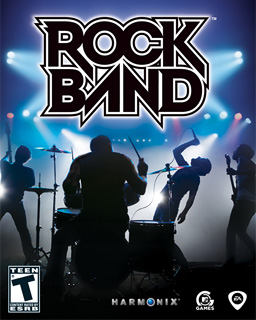
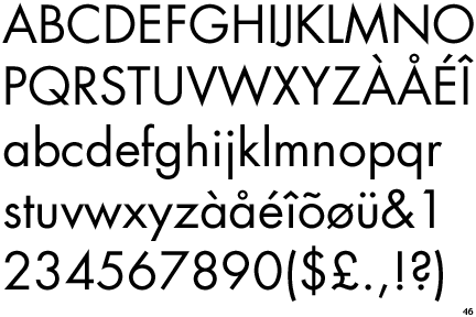
I also found a neat website that has images of arcade machine graphics, including the typography:
http://www.localarcade.com/arcade_art/index.php
Examples:


I also found a neat website that has images of arcade machine graphics, including the typography:
http://www.localarcade.com/arcade_art/index.php
Examples:
Tuesday, September 23, 2008
Readability vs Legibility
Although readability and legibility seem like they would be very similar, there are actually distinct differences between the two. Readability refers to how easy it is to read something, which goes back to how well the text itself is written, designed, and presented. Readability sees the body of text as a whole. On the other hand, legibility goes to a deeper level, looking at the relationships between characters, how they form words, and how those words form sentences. Legibility asks if we understand the parts of the text, readability refers to the text as a whole. Both go hand in hand. However, something does not have to be legibile to be readable: readability also refers to the text's impression on the viewer.
Readability is affected by a variety of factors:
- Color: The easiest colors to read are those set in good contrast, hence why the traditional method is black text on white background. When using colors, avoid colors that are close to each other on the color wheel. In addition, consider the fact that some people are colorblind when choosing colors

- Word Spacing and Leading: Consistent words spacing and leading is important for readability. Too much word spacing creates gaps between words and can sometimes lead to rivers (spaces between words becoming a form themselves) breaking the flow of reading.

In addition, when word spacing exceeds leading, the eye tends to be drawn down the page, rather than across.
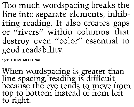
When considering leading, the application is important (long reading should have larger leading, short bits of reading [like when looking something up in a dictionary] can have smaller leading). Too little leading give the text block a darker color and can make it hard to distinguish where to go when moving from one line to the next. Too much leading and the eye can jump around. In addition, certain characteristics of fonts themselves require more leading, such as larger x-heights, strong stroke contrast, or bold time.
- Typeface: Many factors of type can alter it's readability. Generally larger x-heights make reading easier. Fonts with an easily distinguishable upper and lower case also help, as it gives variation to the look of the font on the line and prevents it from looking to static or becoming one big line. In addition, the factors of type that make it legible also make it readable.
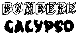
- Line Length: When line length is too long or short it slows down reading. Line length definitely depends on typeface but in general, it can be around 39 characters long ('alphabet and a half rule'). Other techniques include the 'points times two' rule where you take the point size, double it, and use that size in picas for your line length. Using both is a great way to get a range for experimenting with which looks best, and then adjusting columns, margins, fonts, etc. accordingly.


- Justification: Generally, a flush left, right rag is the easiest to read (as long as the rag on the right is kept in check). FRLF tends to be harder to read due to the inconsistent line starting points. In addition, Justification, when used incorrectly (with too many hyphenations, widows, orphens, and awkward gaps in spacing) can also impede reading
- Paragraph density: See word spacing and leading
- Grammar used: no matter how nicely something is designed, if it has bad grammar, it still won't be as readable as a well written piece.
Legibility is affected mainly by the typeface design itself, including:
- letterspacing: letterspacing that is too close makes it hard to distinguish one letter from another, yet too much makes it hard to associate the letters as words. In addition, certain letters consecutively need to be kerned closer together. Letterspacing should create a flow and harmony throughout the page
- x-height: larger x-heights tend to give more legibility, even when the type is shrunken down to smaller sizes. However, in excess, readibility is lowered due to the similarities of certain leters, such as h and n
- serif vs. sans serif- A broad generalization is that serif fonts apply well to printed materials and sans serif fonts apply well online. however, the right font merely depends on the situation.

- word contour/stroke contrast: Again, the varying word contours from using lower case tends to be more readable than ALL CAPS DUE TO IT'S RELATIVE LACK OF CONTOUR. The greater the stroke contrast, the harder it becomes to read the font, especially over long periods of time, due to the limited visibility of the thinner strokes trying to compete with the power and form of the thicker strokes
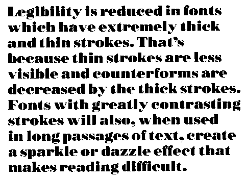
- font height: Certain type faces are meant for larger display, and some are more suited for smaller applications. In general, no smaller than 8pt is a good rule of thumb. Even then, something around 14pt is better due to the number of visually impaired out there.
- font weight: The bolder and thicker the font, the harder it is to read for extended periods of time, due to the solidarity of the forms all becoming a big black mass. In addition, condensed fonts can be hard to read, especially in small sizes and tend to appear very light.
Overall, though, each typeface is different, and the adjustments you make to create greater legibility or readability fall back on the design of the font itself (wide, condensed, large x-height, etc), as well as the environment where it will be used (online, on a billboard, on a business card, etc). The key is finding balance.
Thoughtful quiz question:
Does a font have to be legible in order for it to be readable?
Sources:
Ambrose, Gavin and Harris, Paul. Fundamentals of Typography. 2006
http://archive.cabinetoffice.gov.uk/servicefirst/2001/joinedup/accessible/typeface.htm
http://www.daube.ch/docu/glossary/readability.html
http://en.wikipedia.org/wiki/River_(typography)
http://desktoppub.about.com/cs/finetypography/ht/line_length.htm
http://www.daube.ch/docu/glossary/legibility.html
http://www.problogdesign.com/blog-usability/30-ways-to-improve-readability/
http://www.connorwilson.com/2007/03/12/considering_readability_when_designing/
Readability is affected by a variety of factors:
- Color: The easiest colors to read are those set in good contrast, hence why the traditional method is black text on white background. When using colors, avoid colors that are close to each other on the color wheel. In addition, consider the fact that some people are colorblind when choosing colors
- Word Spacing and Leading: Consistent words spacing and leading is important for readability. Too much word spacing creates gaps between words and can sometimes lead to rivers (spaces between words becoming a form themselves) breaking the flow of reading.
In addition, when word spacing exceeds leading, the eye tends to be drawn down the page, rather than across.
When considering leading, the application is important (long reading should have larger leading, short bits of reading [like when looking something up in a dictionary] can have smaller leading). Too little leading give the text block a darker color and can make it hard to distinguish where to go when moving from one line to the next. Too much leading and the eye can jump around. In addition, certain characteristics of fonts themselves require more leading, such as larger x-heights, strong stroke contrast, or bold time.
- Typeface: Many factors of type can alter it's readability. Generally larger x-heights make reading easier. Fonts with an easily distinguishable upper and lower case also help, as it gives variation to the look of the font on the line and prevents it from looking to static or becoming one big line. In addition, the factors of type that make it legible also make it readable.
- Line Length: When line length is too long or short it slows down reading. Line length definitely depends on typeface but in general, it can be around 39 characters long ('alphabet and a half rule'). Other techniques include the 'points times two' rule where you take the point size, double it, and use that size in picas for your line length. Using both is a great way to get a range for experimenting with which looks best, and then adjusting columns, margins, fonts, etc. accordingly.
- Justification: Generally, a flush left, right rag is the easiest to read (as long as the rag on the right is kept in check). FRLF tends to be harder to read due to the inconsistent line starting points. In addition, Justification, when used incorrectly (with too many hyphenations, widows, orphens, and awkward gaps in spacing) can also impede reading
- Paragraph density: See word spacing and leading
- Grammar used: no matter how nicely something is designed, if it has bad grammar, it still won't be as readable as a well written piece.
Legibility is affected mainly by the typeface design itself, including:
- letterspacing: letterspacing that is too close makes it hard to distinguish one letter from another, yet too much makes it hard to associate the letters as words. In addition, certain letters consecutively need to be kerned closer together. Letterspacing should create a flow and harmony throughout the page
- x-height: larger x-heights tend to give more legibility, even when the type is shrunken down to smaller sizes. However, in excess, readibility is lowered due to the similarities of certain leters, such as h and n
- serif vs. sans serif- A broad generalization is that serif fonts apply well to printed materials and sans serif fonts apply well online. however, the right font merely depends on the situation.
- word contour/stroke contrast: Again, the varying word contours from using lower case tends to be more readable than ALL CAPS DUE TO IT'S RELATIVE LACK OF CONTOUR. The greater the stroke contrast, the harder it becomes to read the font, especially over long periods of time, due to the limited visibility of the thinner strokes trying to compete with the power and form of the thicker strokes
- font height: Certain type faces are meant for larger display, and some are more suited for smaller applications. In general, no smaller than 8pt is a good rule of thumb. Even then, something around 14pt is better due to the number of visually impaired out there.
- font weight: The bolder and thicker the font, the harder it is to read for extended periods of time, due to the solidarity of the forms all becoming a big black mass. In addition, condensed fonts can be hard to read, especially in small sizes and tend to appear very light.
Overall, though, each typeface is different, and the adjustments you make to create greater legibility or readability fall back on the design of the font itself (wide, condensed, large x-height, etc), as well as the environment where it will be used (online, on a billboard, on a business card, etc). The key is finding balance.
Thoughtful quiz question:
Does a font have to be legible in order for it to be readable?
Sources:
Ambrose, Gavin and Harris, Paul. Fundamentals of Typography. 2006
http://archive.cabinetoffice.gov.uk/servicefirst/2001/joinedup/accessible/typeface.htm
http://www.daube.ch/docu/glossary/readability.html
http://en.wikipedia.org/wiki/River_(typography)
http://desktoppub.about.com/cs/finetypography/ht/line_length.htm
http://www.daube.ch/docu/glossary/legibility.html
http://www.problogdesign.com/blog-usability/30-ways-to-improve-readability/
http://www.connorwilson.com/2007/03/12/considering_readability_when_designing/
Friday, September 19, 2008
Thoughts on Design
Ever since Design II, I've started to think about design itself a LOT more. Now, in a semester with 3 design classes, it's pretty hard for me not to notice and questions things around campus, especially posters. It used to be that I'd just walk around and notice if words were spelled wrong on posters....now, I question the design itself: 'well that looks cool, but is it necessary?' 'why did they choose this picture or this font?' 'does the color relate?' etc...In addition, thanks to all of the work we've done in Typography, I ask myself questions like 'what do I read first?' 'what stands out on the page, and is it the main subject?' 'why did they use so many fonts?' 'does it need color?' 'does this create a coding?' etc. Thanks for VisCon, I see birds everywhere, and I consider things like simplicity of the symbols on restrooms, bus stop signs, traffic signs, car insignias....I can really admire symbols and corporate logos now after working on VisCon's second project. 'Clear, Memorable, Innovate' has become my mantra lately, and I'll question symbols I walk by and see if they apply.
Design classes really make you notice how many things you take for granted, and how big and designed our world really is. It's kind of mind blowing.
Design classes really make you notice how many things you take for granted, and how big and designed our world really is. It's kind of mind blowing.
Time Warner
Today, I went to the Art and Architecture library to get books on symbols and logos (to help with my VisCon project).
One of the books had corporate logos and the processes, ideas, etc, that the designers went through to create the symbol. Flipping through this book I came across the page for Time Warner. Time Warner was actually two companies that merged: Time Inc., a publication company, and Warner Communications, an entertainment company. The designer decided to create logo that would encompass the ideas of both journalism and entertainment: looking and listening, reading and hearing, sending and recieing, etc....An eye and an ear were chosen to be used as symbols to represent both aspects, and in the final logo, they are combined to become the logo we know today:
.
I just thought this was a very interesting revelation, because I had never really given too much thought to the logo before. Now I can see the ear and the eye and the logo becomes more powerful that way (kind of like with the arrow in Fed Ex)
Source:
Thomas, Gregory. How to design Logos, Symbols and Icons. 2000
One of the books had corporate logos and the processes, ideas, etc, that the designers went through to create the symbol. Flipping through this book I came across the page for Time Warner. Time Warner was actually two companies that merged: Time Inc., a publication company, and Warner Communications, an entertainment company. The designer decided to create logo that would encompass the ideas of both journalism and entertainment: looking and listening, reading and hearing, sending and recieing, etc....An eye and an ear were chosen to be used as symbols to represent both aspects, and in the final logo, they are combined to become the logo we know today:
.
I just thought this was a very interesting revelation, because I had never really given too much thought to the logo before. Now I can see the ear and the eye and the logo becomes more powerful that way (kind of like with the arrow in Fed Ex)
Source:
Thomas, Gregory. How to design Logos, Symbols and Icons. 2000
Wednesday, September 17, 2008
Videogames and design
One of my hobbies (when I'm not busy with homework...) is playing videogames. As such, I also like to keep up with videogame news through joystiq.com.
Below, I've posted some links from there that relate videogames and art:
http://www.joystiq.com/2008/09/17/agdc-reset-play-more-gaming-inspired-artwork/
^ The Reset/Play exhibit in the Arthouse in Texas
http://www.joystiq.com/2008/09/16/travelling-without-moving-wants-your-videogame-photos/
^An interesting idea for for more meaningful uses of screenshots
In addition, the trailer for the game Mercenaries 2 has not only a catchy song, but also a 'making of' video that shows the steps the company had to take to make the trailer. I didn't really think about it too much, but trailers themselves have to be designed pretty deeply too...it's not just splicing together a bunch of game footage:
Mercenaries 2 Trailer
Making of Mercenaries 2 Trailer
When you think about it, videogames have to be HIGHLY designed. The player must know where to go, what to do, and how to do it, most of the time without being explicitly told 'do this' or 'go here first.' It's something that should come naturally, and most unsuccessful games come from the player having to 'fight' the game, thanks to unclear graphics, confusing level design, glitches, bad button mechanics, or puzzle designs that are too hard to figure out or too hard to accomplish.
And finally:
Here's a small interesting website design...the company logo is also quite intricate, but fits nicely with the company name: Armature
"Why the name, Armature?
It really defines how we work as a company. It's defined as "a skeletal framework built as a support on which a clay, wax, or plaster figure is constructed" and we want to structure our development that way. The first stage of the development is the substructure, and then we direct a larger team of people to help us in filling out the full game."
~Interview with Armature by Joystiq
Below, I've posted some links from there that relate videogames and art:
http://www.joystiq.com/2008/09/17/agdc-reset-play-more-gaming-inspired-artwork/
^ The Reset/Play exhibit in the Arthouse in Texas
http://www.joystiq.com/2008/09/16/travelling-without-moving-wants-your-videogame-photos/
^An interesting idea for for more meaningful uses of screenshots
In addition, the trailer for the game Mercenaries 2 has not only a catchy song, but also a 'making of' video that shows the steps the company had to take to make the trailer. I didn't really think about it too much, but trailers themselves have to be designed pretty deeply too...it's not just splicing together a bunch of game footage:
Mercenaries 2 Trailer
Making of Mercenaries 2 Trailer
When you think about it, videogames have to be HIGHLY designed. The player must know where to go, what to do, and how to do it, most of the time without being explicitly told 'do this' or 'go here first.' It's something that should come naturally, and most unsuccessful games come from the player having to 'fight' the game, thanks to unclear graphics, confusing level design, glitches, bad button mechanics, or puzzle designs that are too hard to figure out or too hard to accomplish.
And finally:
Here's a small interesting website design...the company logo is also quite intricate, but fits nicely with the company name: Armature
"Why the name, Armature?
It really defines how we work as a company. It's defined as "a skeletal framework built as a support on which a clay, wax, or plaster figure is constructed" and we want to structure our development that way. The first stage of the development is the substructure, and then we direct a larger team of people to help us in filling out the full game."
~Interview with Armature by Joystiq
Who knew type was SO complex?
Absolute Measurement
- Measurements with fixed values. They are expressed in finite terms and can't be altered. Points and picas are absolute measurements


Points/Picas
-The basic measurements of type. Points are used to measure font size. Originially, a font's size was determined by the height of its type block (back in the movable type days). Now, it's the measurement of its height from the highest ascender to the lowest descender. 1point (pt) = .35mm or 1/72in. 12pt = 1 pica. Pica is commonly used for measuring lines of type.
Relative Measurement
- Measurements that depend on other variables and thus have no fixed value. Measurements such as leading, character spacing, ems and ens are all relative measurements
 x-height
- the height of the lowercase letters of a font, minus any ascenders or descenders (measured as the length from the baseline to the top of a lowercase x) . The larger the x-height, the larger a font appears to be. in addition, characters with rounded tops (ex. b, d, o, etc) actually extend a little bit over the x-height in order to perceptually seem the same size.
The em. The en
- The em is used to define basic spacing functions. It's equal to the size of the type, so if the type is 36pt, then the em is 36pt. Even though it sounds like it should be realated to the letter m, it the m will rarely be as wide as the em.
- The en is half of the em. So if the type is 36pt, then the en is 18 pt. The en rule is used for nested clauses as well as 'to' phrases, such as in 10 to 11 or 1999 to 2000.
Dashes
- Ems and ens are used in punctuation to dente dash length, and each has a specific function.
- The em is the size of the font itself and is used to separate out parenthetical thoughts as well as to show when there is an interuption
- An en, as stated earlier is 1/2 of an em and is used for nested clauses, as well as the 'to' phrases. In addition, it can be used like the em dash to separate out paranthetical thoughts when an em dash would be at the end of a line or would look odd. The en is also used to combine two hyphenated terms, and also to combine two terms that don't modify each other (for example, with names as is common in science: Boss--Einstein Condensate
- A hyphen is 1/3 of an em, and is used to join words and separate syllables.
- As a note, the bullets I am using in this blog entry are hyphens; in addition, em and en dashes are not part of a standard keyboard and instead fall under special characters.
Alignments: Justification, Flush Left, Flush Right
- Alignment is the relationship of text to the ends of a column
- Justification has even edges and makes a nice shape on the page. It's the most efficient use of space, however, it can lead to awkward gaps when line length is too short when compared to type size. Hyphenation is often used to help make it look more even.
- Flush Left makes the left edge hard, but the right edge soft. Although pretty much the norm today it was rarely used until the 20th century. It follows the flow of language, rather than the idea of a fixed shape. However, one must be careful to make sure the right edge doesn't look too ragged/uneven, nor that it looks too even (thereby looking just like justified alignment). Also, hyphenation should be kept to an absolute minimum.

-Flush Right is the opposite of Flush Left, making the left edge hard and the right edge soft. It is harder to read due to the different starting points of each line, and so should not be used for large bodies of text. However, in smaller blocks is makes effective marginal notes, sidebars, pull quotes or other passages that comment on a main body or image. In addition, a flush or ragged edge can suggest attraction or repulsion between chunks of information.

Letterspacing
- Adusting the space between letters. Generally, however, letterspacing refers to adding spacing and is associated with tracking.


Kerning
-Adjusting the space between letters. Kerning give the letters a more cohesive feel, rather than having a fixed amount of space around each letter. Generally, this is done automatically on the computer, using special kerning tables based on letter pairs. However, when type is changed dramatically, sometimes manual kerning must occur to keep letters from looking awkwardly spaced. Generally, kerning refers to reducing space between type
Tracking
- Adjusting the amount of spacing between characters. Too much positive or negative tracking, however, can make make words hard to read either by making the letter too spaced or our too close together. Negative tracking is rarely desireable. Positive tracking is used most often with capitals and small capitals to give a more regal feel. Generally, tracking refers to increasing the space between type.
Word Spacing
-A relative measurement used to define the spaces between words. It is a percentage value of an em, so it depends on the size of the type. This percentage varies between different typefaces.

 Widow
- A lone word at the end of a paragraph. This is NOT desireable and the type should be somehow adjusted to avoid this
 Orphan
- The final one or two lines of a paragraph separated from the main paragraph to form a new column and should be avoided at all costs
 Leading
- The space between lines of text in a text block. It derives it's name from the strips of lead that were inserted between text measures in order to space them accurately. Leading usually has a larger point size than the text to make the text blook more balanced and well spaced. Since letters in different font faces occupy different amounts of the em square, the same amount of leading and same size can give quite a different effect.
Indent, First Line Indent, Hanging Indent
- Indent is moving some or all of the text lines in from the margins by a specified amount. It gives an easy entry point into a paragraphy, and it related to the size of the type. Additionally it can be determined by the grid.
- First Line Indent is where the text is indeted from the left margin in the first line of the second and subsequent paragraphs. Generally, the first paragraph following a heading, subhead, or crosshead isn't indented because it introduces an awkward space, although it can be done
- Hanging indent is an indention from a left or right margin which affects several textlines (like a running indent), however the first line is not indented.
- Measurements with fixed values. They are expressed in finite terms and can't be altered. Points and picas are absolute measurements
Points/Picas
-The basic measurements of type. Points are used to measure font size. Originially, a font's size was determined by the height of its type block (back in the movable type days). Now, it's the measurement of its height from the highest ascender to the lowest descender. 1point (pt) = .35mm or 1/72in. 12pt = 1 pica. Pica is commonly used for measuring lines of type.
Relative Measurement
- Measurements that depend on other variables and thus have no fixed value. Measurements such as leading, character spacing, ems and ens are all relative measurements
x-height- the height of the lowercase letters of a font, minus any ascenders or descenders (measured as the length from the baseline to the top of a lowercase x) . The larger the x-height, the larger a font appears to be. in addition, characters with rounded tops (ex. b, d, o, etc) actually extend a little bit over the x-height in order to perceptually seem the same size.
The em. The en
- The em is used to define basic spacing functions. It's equal to the size of the type, so if the type is 36pt, then the em is 36pt. Even though it sounds like it should be realated to the letter m, it the m will rarely be as wide as the em.
- The en is half of the em. So if the type is 36pt, then the en is 18 pt. The en rule is used for nested clauses as well as 'to' phrases, such as in 10 to 11 or 1999 to 2000.
Dashes
- Ems and ens are used in punctuation to dente dash length, and each has a specific function.
- The em is the size of the font itself and is used to separate out parenthetical thoughts as well as to show when there is an interuption
- An en, as stated earlier is 1/2 of an em and is used for nested clauses, as well as the 'to' phrases. In addition, it can be used like the em dash to separate out paranthetical thoughts when an em dash would be at the end of a line or would look odd. The en is also used to combine two hyphenated terms, and also to combine two terms that don't modify each other (for example, with names as is common in science: Boss--Einstein Condensate
- A hyphen is 1/3 of an em, and is used to join words and separate syllables.
- As a note, the bullets I am using in this blog entry are hyphens; in addition, em and en dashes are not part of a standard keyboard and instead fall under special characters.
Alignments: Justification, Flush Left, Flush Right
- Alignment is the relationship of text to the ends of a column
- Justification has even edges and makes a nice shape on the page. It's the most efficient use of space, however, it can lead to awkward gaps when line length is too short when compared to type size. Hyphenation is often used to help make it look more even.
- Flush Left makes the left edge hard, but the right edge soft. Although pretty much the norm today it was rarely used until the 20th century. It follows the flow of language, rather than the idea of a fixed shape. However, one must be careful to make sure the right edge doesn't look too ragged/uneven, nor that it looks too even (thereby looking just like justified alignment). Also, hyphenation should be kept to an absolute minimum.
-Flush Right is the opposite of Flush Left, making the left edge hard and the right edge soft. It is harder to read due to the different starting points of each line, and so should not be used for large bodies of text. However, in smaller blocks is makes effective marginal notes, sidebars, pull quotes or other passages that comment on a main body or image. In addition, a flush or ragged edge can suggest attraction or repulsion between chunks of information.
Letterspacing
- Adusting the space between letters. Generally, however, letterspacing refers to adding spacing and is associated with tracking.
Kerning
-Adjusting the space between letters. Kerning give the letters a more cohesive feel, rather than having a fixed amount of space around each letter. Generally, this is done automatically on the computer, using special kerning tables based on letter pairs. However, when type is changed dramatically, sometimes manual kerning must occur to keep letters from looking awkwardly spaced. Generally, kerning refers to reducing space between type
Tracking
- Adjusting the amount of spacing between characters. Too much positive or negative tracking, however, can make make words hard to read either by making the letter too spaced or our too close together. Negative tracking is rarely desireable. Positive tracking is used most often with capitals and small capitals to give a more regal feel. Generally, tracking refers to increasing the space between type.
Word Spacing-A relative measurement used to define the spaces between words. It is a percentage value of an em, so it depends on the size of the type. This percentage varies between different typefaces.
Widow- A lone word at the end of a paragraph. This is NOT desireable and the type should be somehow adjusted to avoid this
Orphan- The final one or two lines of a paragraph separated from the main paragraph to form a new column and should be avoided at all costs
Leading- The space between lines of text in a text block. It derives it's name from the strips of lead that were inserted between text measures in order to space them accurately. Leading usually has a larger point size than the text to make the text blook more balanced and well spaced. Since letters in different font faces occupy different amounts of the em square, the same amount of leading and same size can give quite a different effect.
Indent, First Line Indent, Hanging Indent
- Indent is moving some or all of the text lines in from the margins by a specified amount. It gives an easy entry point into a paragraphy, and it related to the size of the type. Additionally it can be determined by the grid.
- First Line Indent is where the text is indeted from the left margin in the first line of the second and subsequent paragraphs. Generally, the first paragraph following a heading, subhead, or crosshead isn't indented because it introduces an awkward space, although it can be done
- Hanging indent is an indention from a left or right margin which affects several textlines (like a running indent), however the first line is not indented.
Subscribe to:
Posts (Atom)
