I actually found this link when I was searching for 'descender'
http://ascenderdescender.blogspot.com/2008/10/typography-ink.html
I never even thought about using strictly type for a tatoo...it's pretty interesting
Thursday, October 30, 2008

Sunday, October 26, 2008
Lights Camera Action
Watching the opening credits to 'Kiss Kiss Bang Bang' today, I realized that movie opening credits really depend on your integration of the typography with the theme of the movie...While working on my animation storyboard, I realize just how much work it takes to animate type...
The gist of this is I have a new appreciation for movie opening credits
The gist of this is I have a new appreciation for movie opening credits
Saturday, October 25, 2008

One of the newest T-Shirt Designs by (you guessed it) Penny Arcade
For some reason, I find this highly amusing =D
Wednesday, October 22, 2008
Home vs. Reality
http://www.joystiq.com/2008/10/14/tgs-08-sonys-booth-reality-vs-fantasy/
Sony recreated their booth at the TGS (Tokyo Game Show) virtually, so fans in Japan with the PS3 'Home' beta could still visit the booth even if they didn't get to the show.
The virtual version is surprisingly close the the original
It amazes me how far computer graphics have developed
Sony recreated their booth at the TGS (Tokyo Game Show) virtually, so fans in Japan with the PS3 'Home' beta could still visit the booth even if they didn't get to the show.
The virtual version is surprisingly close the the original
It amazes me how far computer graphics have developed
Tuesday, October 21, 2008

Monday, October 13, 2008
Mr. Frutiger
[note: see also my earlier Frutiger post]
Part A: the DESIGNER
-Birth/Death
>>Born: May 24 1928 in Unterseen, near Interlaken, Switzerland (and still alive!)
-Training/Education
>>At the age of 16, he was apprenticed as a compositor (typesetter) at a printing studio for four years, and then attended the Zurich School of Arts and Crafts (Kunstgewerbeschule), focusing on calligraphy...After his schooling, he went to Paris to work for Deberny & Peignot, revamping old types to work on newer machines.
-Milestones
>>It was in 1957, however, that he gained international recognition with the creation of his font Univers.
>>Designed the font for the Charles deGaulle airport
>>Opened his own studio
>>Worked as a consultant for IBM
>>Won numerous awards
-Where do/did they live
>>Did live: Switzerland (Unterseen, Zurich) and France (Paris, also just outside of Paris)
>>Does live: Frutiger is still alive today and lives near Bern, Switzerland
-Attached to an art movement or style:
>> His long career during a time of radically evolving type processes had him adapting for the times
>> Swiss Style
-Why important? What contribute? Why on the list?
>>He created numerous fonts and his prolific life has spanned 3 different type processes: hotmetal, phototypesetting, and digital typesetting
>> Created more than 30 fonts
>> has taught in Paris
>> The Univers grid
>> Wrote numerous books on typography
-Image!
-can use part of interview (source it)
What happened in the year the font you are featuring was made? (manifesto, art, political, social)
1950's - (1954 and 1957 are two dates I'm getting for Univers, so I'm going to do a more general view of the 50's until I figure out which it is)
Sources: (min 6, min 2 of those printed)
Online:
http://www.linotype.com/793-12658/handwriting.html
http://en.wikipedia.org/wiki/Typesetting
http://en.wikipedia.org/wiki/Adrian_Frutiger#cite_note-1
http://www.typophile.com/node/12118
http://www.identifont.com/show?110
http://www.monotypeimaging.com/ProductsServices/TypeDesignerShowcase/AdrianFrutiger/
http://artfilm.ch/adrianfrutiger.php?lang=e&id=adrianfrutiger&suche=dvds
http://en.wikipedia.org/wiki/1950s
Printed:
Ambrose, Gary and Harris, Paul. The Fundamentals of Typography. 2006
Carter, Sebastian. Twentieth Centure Type Designers. 2002
Frutiger, Adrian. Gutenberg-Preisrager. 1986
Frutiger, Adrian. Type Sign Symbol. 1980
Glen, Duncan. Printing type designs: a new history from Gutenberg to 2000. 2001
Perfect, Christopher and Rookledge, Gordon. Rookledge's classic international type finder. 2004 (intro by Adrian Frutiger)
Part A: the DESIGNER
-Birth/Death
>>Born: May 24 1928 in Unterseen, near Interlaken, Switzerland (and still alive!)
-Training/Education
>>At the age of 16, he was apprenticed as a compositor (typesetter) at a printing studio for four years, and then attended the Zurich School of Arts and Crafts (Kunstgewerbeschule), focusing on calligraphy...After his schooling, he went to Paris to work for Deberny & Peignot, revamping old types to work on newer machines.
-Milestones
>>It was in 1957, however, that he gained international recognition with the creation of his font Univers.
>>Designed the font for the Charles deGaulle airport
>>Opened his own studio
>>Worked as a consultant for IBM
>>Won numerous awards
-Where do/did they live
>>Did live: Switzerland (Unterseen, Zurich) and France (Paris, also just outside of Paris)
>>Does live: Frutiger is still alive today and lives near Bern, Switzerland
-Attached to an art movement or style:
>> His long career during a time of radically evolving type processes had him adapting for the times
>> Swiss Style
-Why important? What contribute? Why on the list?
>>He created numerous fonts and his prolific life has spanned 3 different type processes: hotmetal, phototypesetting, and digital typesetting
>> Created more than 30 fonts
>> has taught in Paris
>> The Univers grid
>> Wrote numerous books on typography
-Image!
-can use part of interview (source it)
Part B: the FONTS
-All the fonts he designed:
Apollo
Avenir
Avenir Black
Avenir Next
Breughel
Linotype Centennial
Courier New
Linotype Didot
URW Egyptienne
Egyptienne F
Frutiger
Frutiger Capitalis
Frutiger Condensed
Frutiger Serif
Frutiger Stones
Frutiger Symbols
Glypha
Herculanum
Humanist 777
Humanist Slabserif 712
Iridium
Latin 725
Meridien
Nami
OCR A
OCR B
OCR B Letterpress
EF OCR-B
OCR-B (BT)
Ondine
Ondine (URW)
Pompeijana
Pompeijana Borders
President (URW)
Rusticana
Rusticana Borders
Serifa
Serifa (BT)
Serifa (URW)
Linotype Univers
Univers
Linotype Univers Compressed
Linotype Univers Condensed
Univers Condensed
Linotype Univers Extended
Univers Extended
Linotype Univers Extra Black
Linotype Univers Ultra Light
Vectora
Versailles
Westside
Zurich
Choose a font (classify, visually/verbally describe characteristics)
-Univers (see earlier Frutiger post) 1957
-6 characteristics
>>Sans Serif
>>monoweight
>>entirety of the font was developed at once (aka the entire grid was created, rather than adding on styles later)
>>no stress
>>tail of the uppercase Roman Q runs straight along the baseline
>>first type family to feature the numbering system for different styles
>>'neogrotesque'
>>larger x-height
What happened in the year the font you are featuring was made? (manifesto, art, political, social)
1950's - (1954 and 1957 are two dates I'm getting for Univers, so I'm going to do a more general view of the 50's until I figure out which it is)
art- Swiss style, Abstract Expressionism, early day of Pop Art
political- Korean War, Cold War
social- teenager's importance in the market increased, consumer boom and increase in culture from people fleeing from WWII
science- Sputnik, Fortran
Sources: (min 6, min 2 of those printed)
Online:
http://www.linotype.com/793-12658/handwriting.html
http://en.wikipedia.org/wiki/Typesetting
http://en.wikipedia.org/wiki/Adrian_Frutiger#cite_note-1
http://www.typophile.com/node/12118
http://www.identifont.com/show?110
http://www.monotypeimaging.com/ProductsServices/TypeDesignerShowcase/AdrianFrutiger/
http://artfilm.ch/adrianfrutiger.php?lang=e&id=adrianfrutiger&suche=dvds
http://en.wikipedia.org/wiki/1950s
Printed:
Ambrose, Gary and Harris, Paul. The Fundamentals of Typography. 2006
Carter, Sebastian. Twentieth Centure Type Designers. 2002
Frutiger, Adrian. Gutenberg-Preisrager. 1986
Frutiger, Adrian. Type Sign Symbol. 1980
Glen, Duncan. Printing type designs: a new history from Gutenberg to 2000. 2001
Perfect, Christopher and Rookledge, Gordon. Rookledge's classic international type finder. 2004 (intro by Adrian Frutiger)
Sunday, October 12, 2008
Penny Arcade
Penny Arcade is one of my favorite webcomics. (Yay for gaming comics!) However, what struck me was that this week, the comic's artist posted a picture of one of his painting he did, trying to learn new techniques and imitate a certain style:


It just reminded me that no matter what type of art you go into, it's always nice to also branch out and learn new skills.
It just reminded me that no matter what type of art you go into, it's always nice to also branch out and learn new skills.
Friday, October 10, 2008

Tuesday, October 7, 2008
Interesting art
http://www.joystiq.com/photos/madworld-leipzig-2008/989869/full/
These screenshots are taken from the upcoming game Mad World...what interested me was the stark chiaroscuro feel, along with used of red for emphasis...it made me think of comic books, but taken to a more extreme level
These screenshots are taken from the upcoming game Mad World...what interested me was the stark chiaroscuro feel, along with used of red for emphasis...it made me think of comic books, but taken to a more extreme level
Sunday, October 5, 2008
Random interesting stuff
I've always been intrigued by cel-shading, and I think that these two trailers for Mirror's Edge are a wonderful blend of cel-shaded animation and narrative
http://www.joystiq.com/2008/09/26/faith-based-cel-shaded-mirrors-edge-trailer-shows-origin-story/
http://gamevideos.1up.com/video/id/19848
I've always held an interest in trailers and how they could show you so much, and yet so little...they can garner interest from just minutes of your time. I really admire people who make great trailers...I have a hard enough time trying to describe a movie or game to someone without revealing key elements of story or without referencing something else to describe it.
And of course, graphic novels have a special place in my heart...I love how they can express movement and emotion through still images. Here are some samples of two found recently on Joystiq.com
Mirror's Edge comic
Prince of Persia graphic novel (which ironically has nothing to do with the videogame series)
Finally, the Indie game development community seems to be growing more and more, and
"All week, Joystiq will be revealing the 26 finalists for the IndieCade: International Festival of Independent Games, set to take place October 10 through 17 in Bellevue, Washington. The winners will be announced on October 11." ~Joystiq.com
I think it's interesting to see the ideas that low budget developers come up with, especially to win a competition. They really have to have ideas that stand out, and everything must be extremely well designed...to me, I feel like they focus on what really matters in a game when they're not buffered by access to a lot of money (which I think is sometimes forgotten by big name companies, who sometimes rely only on the fact that they can have high resolution beautiful graphics and forget gameplay)... and so, for your viewing pleasure, screenshots and/or videos of the 26 finalists:
1-5
6-10
11-15
16-20
21-26
http://www.joystiq.com/2008/09/26/faith-based-cel-shaded-mirrors-edge-trailer-shows-origin-story/
http://gamevideos.1up.com/video/id/19848
I've always held an interest in trailers and how they could show you so much, and yet so little...they can garner interest from just minutes of your time. I really admire people who make great trailers...I have a hard enough time trying to describe a movie or game to someone without revealing key elements of story or without referencing something else to describe it.
And of course, graphic novels have a special place in my heart...I love how they can express movement and emotion through still images. Here are some samples of two found recently on Joystiq.com
Mirror's Edge comic
Prince of Persia graphic novel (which ironically has nothing to do with the videogame series)
Finally, the Indie game development community seems to be growing more and more, and
"All week, Joystiq will be revealing the 26 finalists for the IndieCade: International Festival of Independent Games, set to take place October 10 through 17 in Bellevue, Washington. The winners will be announced on October 11." ~Joystiq.com
I think it's interesting to see the ideas that low budget developers come up with, especially to win a competition. They really have to have ideas that stand out, and everything must be extremely well designed...to me, I feel like they focus on what really matters in a game when they're not buffered by access to a lot of money (which I think is sometimes forgotten by big name companies, who sometimes rely only on the fact that they can have high resolution beautiful graphics and forget gameplay)... and so, for your viewing pleasure, screenshots and/or videos of the 26 finalists:
1-5
6-10
11-15
16-20
21-26
Friday, October 3, 2008
Games and type
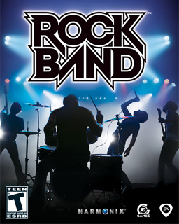
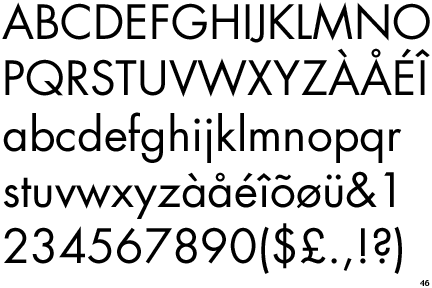
Well, I was looking at my video games today, trying to pick a game to play, and I realized that the first thing that went through my head were things like: 'Oh, that title is in a san-serif font' and 'Wow that has a thick stroke weight'...In addition, when I looked at Rock Band, I realized that the 'o' is almost perfectly round and it made me think of Futura.
I also found a neat website that has images of arcade machine graphics, including the typography:
http://www.localarcade.com/arcade_art/index.php
Examples:


I also found a neat website that has images of arcade machine graphics, including the typography:
http://www.localarcade.com/arcade_art/index.php
Examples:
Subscribe to:
Posts (Atom)
