-- why do we (designers) use a grid? what are the benefits or functions?
-- include any online links, research, thoughts, examples...
Designers use a grid to help them arrange visual elements. The grid gives control and organization to a piece, allowing a designer to repeat elements of the grid throughout a work, adding consistency while avoiding monotony. Grids are especially helpful for aligning objects vertically or horizontally on the page, especially in a modular grid. Grids help to create movement, to lead the viewer's eye around the page, and to arrange the use of space.
 Grids can range from simple to complex, depending on the function and content of the grid. For example, text on a page of a novel is usually arranged in one large single column grid. Margins around the edges allow for information like page number and chapter title, as well as buffer space to keep the text from running into the spine of the book (where it would be hard to read), or from pushing it too close to the edge of the page (where there would be no space to hold the page). The grid for a magazine, however, would become more complex, leaving room for numerous pictures, captions, larger article titles, etc., while also conforming to an overall consistent grid for the whole magazine itself. The main thing to remember about grids is that they can (and should be) tailored to the situation.
 The grid is used as a foundation, something that helps gives the designer control the arrangement on the page, while also being flexible enough to allow designer to work in a dynamic fashion. It should not be viewed as a restriction; rather it is a tool for the designer, highly adaptable for many situations. Not all grids have to be straight vertical and horizontal lines. However, when using different grids, or eschewing grids altogether, the designer must be especially careful when creating the layout. The layout still needs the control, order, hierarchy, etc., because the viewer doesn't not even have any sort of linear grid pattern to fall back on.
 In our day and age, grids exist not only in print form, but also in the virtual real of internet. I was surprised when I searched 'grid design' in Google, and I returned a bunch of URLs for CSS website grids. I didn't even think about how websites are made out of grids, even though just looking at them, it all makes sense.
In all honesty, my very first association with the word 'grid' is the Cartesian coordinate system (I am a math minor). If you think about it, graphing and graph paper illustrates the main use of a grid: a visible illustration of abstract ideas. Without the graphical foundation, it's hard to understand equations like y=x or y=x^2, and harder still to explain it to others. In the same way, putting your ideas on paper for design on paper helps you to see what it would look like, because if I've learned anything from Design II, ideas in your head sometimes just don't transfer to paper the same. Consider also the flexibility of graphs: you can change the scale (0 to 10? 0 to .001? 0 to 10^30?), you can change the values (x=time, x=distance, x= number of waffles, etc), and you can even change the way you use the graph (ex. using polar coordinates). In the same way, grids in design are immensely flexible and are there to work FOR you, not AGAINST you.
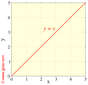
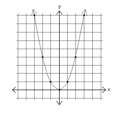

from left to right:
y=x
x=x^2
polar coordinate graphing
 Grids are present in more places and in more ways that I ever even thought about. Just looking around my dorm room, I can look at different items and see the grids underlying them. Recognizable enough to direct my eye [Sketch...Strathmore...A lightweight sketch paper suited...], but subtle enough that the grid doesn't jump off the page. I feel like now that I've started noticing grids, I'll never stop noticing them. It's like my eye's are slowly being opened to this secret world that's hidden in plain sight. Grids can be quite powerful tools, and I hope that all this research helps me with my homework!
[As a side note, I love relating math and art...I think that a lot of people view them as two totally removed and separate fields, when really there are a lot of parallels and interesting connections...some that people use and don't even realize it (golden ration, proportions/scale, to name a few)]
Sources:
- Sketchpad pic
- Polar graph pic
- y=x^2 pic
- y=x pic
- Mark Boulton
- Grid -Wikipedia
- Six Creative Column Techniques
- Design by Grid
- Article about CSS layouts


