

 Adrian Frutiger is one of the most influential typographers of the 20th century. Born on May 24, 1928, the life and work of this Swiss graphic designer has spanned the ages of drastically different type processes: hotmetal, phototypesetting, and digital typesetting. He has written many books, won numerous awards, and his fonts have become famous and are used world wide. In addition to being a typographer, he is also quite well rounded as a painter, sculptor, symbolist and mathematician.
Frutiger grew up in the beautiful Unterseen, near Interlaken, Switzerland. Unterseen was located in a narrow valley, surrounded by mountains and two lakes. Growing up he loved to spend early evenings (when he wasn't busy with school, work, or play) enjoying the scenery: watching the mist roll across the land and watching the sun set over the mountains. The scenery would continue to give him a nostalgic feeling, even after finding similar feelings in Paris, leading to his eventual return to Switzerland later in life.

As a boy, Frutiger never really cared for school. Under the Swiss school system, he was forced to learn a particular type of handwriting: a cursive, slanted, formal, and standardized way of writing that every boy in the German-Swiss school style was taught. At the age of 15, however, he began to rebel against this style of writing after receiving a letter from one of his idols: Ernst Eberhart. Eberhart's upright handwriting with rounded and open forms inspired the young Frutiger to attempt new ways of writing. He began to alter his pen, cutting it down to a broad nib to imitate the look of Eberhart's writing.
 However, Frutiger didn't rebel against all Swiss traditional values. In fact, he was greatly interested by the Bernese (people of Bern in Switzerland) tradition of paper cutting. He was amazed at the amount of detail that could be achieved through this subtractive, rather than additive process. He would later say that “the black-and-white contrast soon came to play an important part in my professional life. The contrast conveys the absolute construction of an image. Taking black away means adding white. In this way, the space between an R and an S becomes like a sculpture for me.” In fact, Frutiger's first artistic interest was sculpture. However, he was discouraged by his teachers and father, a weaver, from pursuing this career path, he was instead directed towards printing.
And so his typographic education continued, expanding to the real world, when at the age of 16, he was apprenticed as a compositor (typesetter) at a printing studio in Interlaken. Four years later, he left for Zurich to attend the Zurich School of Arts and Crafts (Kunstgewerbeschule). There, from 1949 to 1951, he was lucky enough to be taught by two renowned typography teachers: Walter Käch and Alfred Willimann.
Käch's classes focused on learning to very carefully examine typefaces, looking at stroke formations, measurements and proportions. By making rubbings of Roman inscriptions from museums, Frutiger could see first hand the processes and designs behind these early fonts. He was shown how the swelling and diminishing curves must have first been put on the monument with a brush before being carved out to achieve such fluidity. Käch's classes took this idea to heart, scorning the use of rulers and draftman's tools for freehand font creation. Käch's classes would have a great influence on Frutiger's approach to typography, but rather than merely copying the style, Frutiger would use the ideas as a departure point to fuel his own ideas. Frutiger worked on the development of sans serifed fonts during this time.
In addition, during his first years in Zurich he became friends with Emil Ruder, one of the pioneers of the Swiss style. The Swiss, or international style, greatly influenced Frutiger, with the idea of elegance in simplicity, clarity, and readabilty, using underlying grids and sans serifed fonts. Ruder and Frutiger's friendship would continue until Ruder's death in 1970.
Frutiger gained his first form of public recognition in 1951 at age 23. For a school project, he created an illustrated essay on the development of western letterforms entitled: Schrift / Écriture / Lettering: the development of European letter types carved in wood. This project was meticulously carved out in wood demonstrating his knowledge and appreciation for letterforms and his skill at illustrating them. Apart from winning him a prize from the Swiss ministry of the interior, the project also caught the attention of Deberny & Peignot, a French type foundry. Charles Peignot hired Frutiger to come and work in Paris.
So, upon completion of his schooling Frutiger leaves Switzerland for the first time, now calling Paris his new home. There, he supervised the revamping of older hot press typefaces such as Baskerville, Garmond, and Bodoni, to work on the newer phototypesetting machines, as well as begin designing typefaces himself, including “Président", "Phoebus", and "Ondine;" all released in 1954.
It was in 1957, however, that Frutiger released the font that would gain him worldwide recognition: Univers. While converting all of the old font from the metal typesetting process to the phototypesetting, Frutiger asked if he could create a new sans serif font that could be used for both processes. The success of Futura (created by another type foundry) prompted Charles Peignot, co-founder of the foundry, to agree. However, Frutiger argued against a geometric take on the font, and rather promoted something more realistic (or 'neogrotesque'). In addition, thanks to the versatility of the phototypesetting, the typographer was no longer limited to merely the styles of roman, bold, and italic. In fact, Frutiger's vision was that of a united font family, available in a variety of styles. In addition, the styles would all be classified in a numeric system, rather than by name, making the font easily accessible across languages and cultures. With the idea that this would be a 'universal' font, the name Univers was chosen.
In 1961, Frutiger left Deberny & Peignot with Charles Peignots consent and blessing, founding his own studio outside of Paris in Arcueil with Bruno Pfäffli and André Gürtler, coworkers from Deberny & Peignot. It was here the Frutiger could begin to work not only on typeface deign, but also on independent typographic work.
In the 1970's he was commissioned by the Paris Metro to revamp their signage. He created an altered form of Univers specifically made to be readable in poor light and in white text on a dark background (the colors of the signage). Thanks to the success of this job, Frutiger got his next assignment: creating signage for the soon to be built Charles de Gaulle Airport in Paris. Working closely with Paul Andreu, the architect and engineer of the project, Frutiger began work on a new font, rather than just readapting Univers again. Frutiger realized an important factor needed for airport signs: the signs were rarely read head on and were usual seen at an angle (while walking or driving by). In additions, the signage in this airport was to be in English and French, the the letters must be large enough to read from a distance. The font therefore, had to be wider and highly legible. The new font, dubbed Roissy, would later be released by Linotype under the name Frutiger, and Mr. Frutiger would go on to design even more fonts for the company, including Avenir, Centennial, and Serifa.
In addition, Frutiger created the OCR-B typeface, a more stylized response to the American made OCR-A typeface, making use of advanced technology and the ability to use a finer grid. Through a 5 year collaboration process, OCR-B was finally released and in 1973 was accepted as an ISO world standard.
In the late 1990's, more than 40 after it's creation, Frutiger was commissioned to revamp Univers, digitalizing it into one standardized format to be used more easily worldwide (in earlier days, the cuts, although close, were not exactly the same, country to country). Frutiger gladly accepted the job, saying, “The decision to redesign the Univers family was something I felt as a personal gift. I produced the letterforms with the same delight as 45 years previously."
After a heart operation in 1994, Frutiger began to work on his memoirs, feeling that since his work has spanned so many years and so many different type processes, he should share this information with the world. Frutiger is still alive today, at the ripe age of 80, and lives near Bern, Switzerland. Over his lifetime, he has produced more than 30 fonts (and is still producing them today). He has taught at two french schools (at the Ecole Estienne for ten years and Ecole Nationale Supérieure des Arts Décoratifs for eight years), written numerous books, and has won numerous awards including the Gutenberg Prize of the City of Mainz (Germany); 1987, Medal of the Type Directors Club of New York; 1993, Officier de lÕOrdre des Arts et des Lettres (Paris); 1993, Grand Prix National des Arts Graphiques (France). [list of awards from http://www.identifont.com/show?110]. He has even worked as a consultant for IBM.
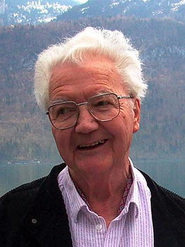 Adrian Frutiger has greatly impacted our world today, from redesigning signage, to the creation of the Univers grid. His contributions to the world of typography, spanning 50 years and the drastically evolving world of typography clearly demonstrate his mastery of the art. Frutiger is, and will remain, one of the premier type designers of the 20th century.
Adrian Frutiger: Der Mann von Schwarz und Weiss: a video filmed by Frutiger's nephew. This is a very small (in size) trailer for the movie. An English version of the text on the page is here.
Part B: all of the fonts
-All the fonts he designed:
Apollo
Avenir
Avenir Black
Avenir Next
Breughel
Linotype Centennial
Courier New
Linotype Didot
URW Egyptienne
Egyptienne F
Frutiger
Frutiger Capitalis
Frutiger Condensed
Frutiger Serif
Frutiger Stones
Frutiger Symbols
Glypha
Herculanum
Humanist 777
Humanist Slabserif 712
Iridium
Latin 725
Meridien
Nami
OCR A
OCR B
OCR B Letterpress
EF OCR-B
OCR-B (BT)
Ondine
Ondine (URW)
Pompeijana
Pompeijana Borders
President (URW)
Rusticana
Rusticana Borders
Serifa
Serifa (BT)
Serifa (URW)
Linotype Univers
Univers
Linotype Univers Compressed
Linotype Univers Condensed
Univers Condensed
Linotype Univers Extended
Univers Extended
Linotype Univers Extra Black
Linotype Univers Ultra Light
Vectora
Versailles
Westside
Zurich


UNIVERS
 Univers is a sans serif font created by Mr. Frutiger first released in 1957, revised 40 years laer, and now contains over 44 different styles. It was the first font to use his special numbered classification for the different styles of the font face. Univers was also unique in that the entire family of font styles was all created at once as a complete unit, rather than later being expanded upon.
In this univers grid, even numbers are italic (or oblique) and odd numbers are roman. The first number stands for the stoke weight, with 1 being lightest and 9 being heaviest. The second number represents the position and width. with 1 being the most extended to 9 being the most condensed. By this system, 55 is the the original, roman style of the typeface.

6 characteristics
1.Sans Serif (Neogrotesque to be more specific)
2.Monoweight
3.Entirety of the font was developed at once (aka the entire grid was created, rather than adding on styles later). It's also the first type family to feature the numbering system for different styles
4.No stress
5.Tail of the uppercase Roman Q runs straight along the baseline
6.Larger x-height

Part C: Events of 1957
1.The Swiss Style of graphic design was being developed during this time
2.The Cold War is still going on
3.The first compiler for FORTAN, a scientific programming language, is sold by IBM
4.Sputnik is launched
5.Dwight D. Eisenhower is inaugerated
6.During the 50's the teenager's importance in the market increased. There is also a consumer boom and increase in culture from people who had fled from WWII
Sources: (min 6, min 2 of those printed)
Online:
http://www.linotype.com/793-12658/handwriting.html
http://en.wikipedia.org/wiki/Typesetting
http://en.wikipedia.org/wiki/Adrian_Frutiger#cite_note-1
http://www.typophile.com/node/12118
http://www.identifont.com/show?110
http://www.monotypeimaging.com/ProductsServices/TypeDesignerShowcase/AdrianFrutiger/
http://artfilm.ch/adrianfrutiger.php?lang=e&id=adrianfrutiger&suche=dvds
http://en.wikipedia.org/wiki/1950s
http://www.artandculture.com/cgi-bin/WebObjects/ACLive.woa/wa/artist?id=190
Printed:
Ambrose, Gary and Harris, Paul. The Fundamentals of Typography. 2006
Carter, Sebastian. Twentieth Centure Type Designers. 2002
Frutiger, Adrian. Gutenberg-Preisrager. 1986
Frutiger, Adrian. Type Sign Symbol. 1980
Glen, Duncan. Printing type designs: a new history from Gutenberg to 2000. 2001
Perfect, Christopher and Rookledge, Gordon. Rookledge's classic international type finder. 2004 (intro by Adrian Frutiger)


No comments:
Post a Comment