Readability is affected by a variety of factors:
- Color: The easiest colors to read are those set in good contrast, hence why the traditional method is black text on white background. When using colors, avoid colors that are close to each other on the color wheel. In addition, consider the fact that some people are colorblind when choosing colors

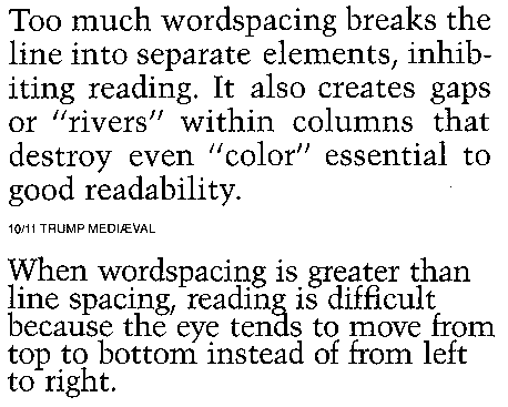
- Word Spacing and Leading: Consistent words spacing and leading is important for readability. Too much word spacing creates gaps between words and can sometimes lead to rivers (spaces between words becoming a form themselves) breaking the flow of reading.

In addition, when word spacing exceeds leading, the eye tends to be drawn down the page, rather than across.
When considering leading, the application is important (long reading should have larger leading, short bits of reading [like when looking something up in a dictionary] can have smaller leading). Too little leading give the text block a darker color and can make it hard to distinguish where to go when moving from one line to the next. Too much leading and the eye can jump around. In addition, certain characteristics of fonts themselves require more leading, such as larger x-heights, strong stroke contrast, or bold time.
- Typeface: Many factors of type can alter it's readability. Generally larger x-heights make reading easier. Fonts with an easily distinguishable upper and lower case also help, as it gives variation to the look of the font on the line and prevents it from looking to static or becoming one big line. In addition, the factors of type that make it legible also make it readable.
- Line Length: When line length is too long or short it slows down reading. Line length definitely depends on typeface but in general, it can be around 39 characters long ('alphabet and a half rule'). Other techniques include the 'points times two' rule where you take the point size, double it, and use that size in picas for your line length. Using both is a great way to get a range for experimenting with which looks best, and then adjusting columns, margins, fonts, etc. accordingly.


- Justification: Generally, a flush left, right rag is the easiest to read (as long as the rag on the right is kept in check). FRLF tends to be harder to read due to the inconsistent line starting points. In addition, Justification, when used incorrectly (with too many hyphenations, widows, orphens, and awkward gaps in spacing) can also impede reading
- Paragraph density: See word spacing and leading
- Grammar used: no matter how nicely something is designed, if it has bad grammar, it still won't be as readable as a well written piece.
Legibility is affected mainly by the typeface design itself, including:
- letterspacing: letterspacing that is too close makes it hard to distinguish one letter from another, yet too much makes it hard to associate the letters as words. In addition, certain letters consecutively need to be kerned closer together. Letterspacing should create a flow and harmony throughout the page
- x-height: larger x-heights tend to give more legibility, even when the type is shrunken down to smaller sizes. However, in excess, readibility is lowered due to the similarities of certain leters, such as h and n
- serif vs. sans serif- A broad generalization is that serif fonts apply well to printed materials and sans serif fonts apply well online. however, the right font merely depends on the situation.

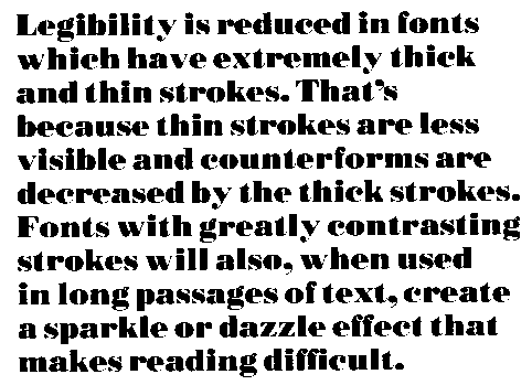
- word contour/stroke contrast: Again, the varying word contours from using lower case tends to be more readable than ALL CAPS DUE TO IT'S RELATIVE LACK OF CONTOUR. The greater the stroke contrast, the harder it becomes to read the font, especially over long periods of time, due to the limited visibility of the thinner strokes trying to compete with the power and form of the thicker strokes
- font height: Certain type faces are meant for larger display, and some are more suited for smaller applications. In general, no smaller than 8pt is a good rule of thumb. Even then, something around 14pt is better due to the number of visually impaired out there.
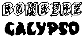
- font weight: The bolder and thicker the font, the harder it is to read for extended periods of time, due to the solidarity of the forms all becoming a big black mass. In addition, condensed fonts can be hard to read, especially in small sizes and tend to appear very light.
Overall, though, each typeface is different, and the adjustments you make to create greater legibility or readability fall back on the design of the font itself (wide, condensed, large x-height, etc), as well as the environment where it will be used (online, on a billboard, on a business card, etc). The key is finding balance.
Thoughtful quiz question:
Does a font have to be legible in order for it to be readable?
Sources:
Ambrose, Gavin and Harris, Paul. Fundamentals of Typography. 2006
http://archive.cabinetoffice.gov.uk/servicefirst/2001/joinedup/accessible/typeface.htm
http://www.daube.ch/docu/glossary/readability.html
http://en.wikipedia.org/wiki/River_(typography)
http://desktoppub.about.com/cs/finetypography/ht/line_length.htm
http://www.daube.ch/docu/glossary/legibility.html
http://www.problogdesign.com/blog-usability/30-ways-to-improve-readability/
http://www.connorwilson.com/2007/03/12/considering_readability_when_designing/


