http://www.joystiq.com/photos/madworld-leipzig-2008/989869/full/
These screenshots are taken from the upcoming game Mad World...what interested me was the stark chiaroscuro feel, along with used of red for emphasis...it made me think of comic books, but taken to a more extreme level
Tuesday, October 7, 2008

Sunday, October 5, 2008
Random interesting stuff
I've always been intrigued by cel-shading, and I think that these two trailers for Mirror's Edge are a wonderful blend of cel-shaded animation and narrative
http://www.joystiq.com/2008/09/26/faith-based-cel-shaded-mirrors-edge-trailer-shows-origin-story/
http://gamevideos.1up.com/video/id/19848
I've always held an interest in trailers and how they could show you so much, and yet so little...they can garner interest from just minutes of your time. I really admire people who make great trailers...I have a hard enough time trying to describe a movie or game to someone without revealing key elements of story or without referencing something else to describe it.
And of course, graphic novels have a special place in my heart...I love how they can express movement and emotion through still images. Here are some samples of two found recently on Joystiq.com
Mirror's Edge comic
Prince of Persia graphic novel (which ironically has nothing to do with the videogame series)
Finally, the Indie game development community seems to be growing more and more, and
"All week, Joystiq will be revealing the 26 finalists for the IndieCade: International Festival of Independent Games, set to take place October 10 through 17 in Bellevue, Washington. The winners will be announced on October 11." ~Joystiq.com
I think it's interesting to see the ideas that low budget developers come up with, especially to win a competition. They really have to have ideas that stand out, and everything must be extremely well designed...to me, I feel like they focus on what really matters in a game when they're not buffered by access to a lot of money (which I think is sometimes forgotten by big name companies, who sometimes rely only on the fact that they can have high resolution beautiful graphics and forget gameplay)... and so, for your viewing pleasure, screenshots and/or videos of the 26 finalists:
1-5
6-10
11-15
16-20
21-26
http://www.joystiq.com/2008/09/26/faith-based-cel-shaded-mirrors-edge-trailer-shows-origin-story/
http://gamevideos.1up.com/video/id/19848
I've always held an interest in trailers and how they could show you so much, and yet so little...they can garner interest from just minutes of your time. I really admire people who make great trailers...I have a hard enough time trying to describe a movie or game to someone without revealing key elements of story or without referencing something else to describe it.
And of course, graphic novels have a special place in my heart...I love how they can express movement and emotion through still images. Here are some samples of two found recently on Joystiq.com
Mirror's Edge comic
Prince of Persia graphic novel (which ironically has nothing to do with the videogame series)
Finally, the Indie game development community seems to be growing more and more, and
"All week, Joystiq will be revealing the 26 finalists for the IndieCade: International Festival of Independent Games, set to take place October 10 through 17 in Bellevue, Washington. The winners will be announced on October 11." ~Joystiq.com
I think it's interesting to see the ideas that low budget developers come up with, especially to win a competition. They really have to have ideas that stand out, and everything must be extremely well designed...to me, I feel like they focus on what really matters in a game when they're not buffered by access to a lot of money (which I think is sometimes forgotten by big name companies, who sometimes rely only on the fact that they can have high resolution beautiful graphics and forget gameplay)... and so, for your viewing pleasure, screenshots and/or videos of the 26 finalists:
1-5
6-10
11-15
16-20
21-26
Friday, October 3, 2008
Games and type
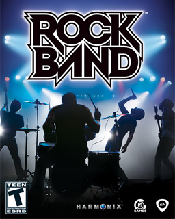
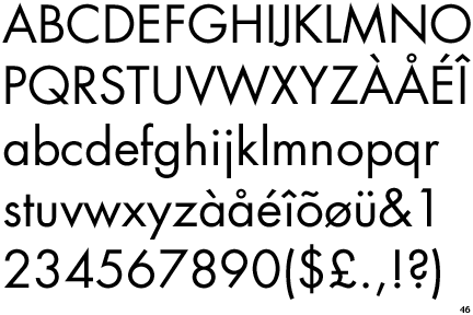
Well, I was looking at my video games today, trying to pick a game to play, and I realized that the first thing that went through my head were things like: 'Oh, that title is in a san-serif font' and 'Wow that has a thick stroke weight'...In addition, when I looked at Rock Band, I realized that the 'o' is almost perfectly round and it made me think of Futura.
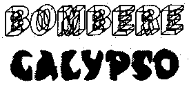
I also found a neat website that has images of arcade machine graphics, including the typography:
http://www.localarcade.com/arcade_art/index.php
Examples:


I also found a neat website that has images of arcade machine graphics, including the typography:
http://www.localarcade.com/arcade_art/index.php
Examples:
Tuesday, September 23, 2008
Readability vs Legibility
Although readability and legibility seem like they would be very similar, there are actually distinct differences between the two. Readability refers to how easy it is to read something, which goes back to how well the text itself is written, designed, and presented. Readability sees the body of text as a whole. On the other hand, legibility goes to a deeper level, looking at the relationships between characters, how they form words, and how those words form sentences. Legibility asks if we understand the parts of the text, readability refers to the text as a whole. Both go hand in hand. However, something does not have to be legibile to be readable: readability also refers to the text's impression on the viewer.
Readability is affected by a variety of factors:
- Color: The easiest colors to read are those set in good contrast, hence why the traditional method is black text on white background. When using colors, avoid colors that are close to each other on the color wheel. In addition, consider the fact that some people are colorblind when choosing colors

- Word Spacing and Leading: Consistent words spacing and leading is important for readability. Too much word spacing creates gaps between words and can sometimes lead to rivers (spaces between words becoming a form themselves) breaking the flow of reading.

In addition, when word spacing exceeds leading, the eye tends to be drawn down the page, rather than across.
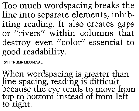
When considering leading, the application is important (long reading should have larger leading, short bits of reading [like when looking something up in a dictionary] can have smaller leading). Too little leading give the text block a darker color and can make it hard to distinguish where to go when moving from one line to the next. Too much leading and the eye can jump around. In addition, certain characteristics of fonts themselves require more leading, such as larger x-heights, strong stroke contrast, or bold time.
- Typeface: Many factors of type can alter it's readability. Generally larger x-heights make reading easier. Fonts with an easily distinguishable upper and lower case also help, as it gives variation to the look of the font on the line and prevents it from looking to static or becoming one big line. In addition, the factors of type that make it legible also make it readable.
- Line Length: When line length is too long or short it slows down reading. Line length definitely depends on typeface but in general, it can be around 39 characters long ('alphabet and a half rule'). Other techniques include the 'points times two' rule where you take the point size, double it, and use that size in picas for your line length. Using both is a great way to get a range for experimenting with which looks best, and then adjusting columns, margins, fonts, etc. accordingly.


- Justification: Generally, a flush left, right rag is the easiest to read (as long as the rag on the right is kept in check). FRLF tends to be harder to read due to the inconsistent line starting points. In addition, Justification, when used incorrectly (with too many hyphenations, widows, orphens, and awkward gaps in spacing) can also impede reading
- Paragraph density: See word spacing and leading
- Grammar used: no matter how nicely something is designed, if it has bad grammar, it still won't be as readable as a well written piece.
Legibility is affected mainly by the typeface design itself, including:
- letterspacing: letterspacing that is too close makes it hard to distinguish one letter from another, yet too much makes it hard to associate the letters as words. In addition, certain letters consecutively need to be kerned closer together. Letterspacing should create a flow and harmony throughout the page
- x-height: larger x-heights tend to give more legibility, even when the type is shrunken down to smaller sizes. However, in excess, readibility is lowered due to the similarities of certain leters, such as h and n
- serif vs. sans serif- A broad generalization is that serif fonts apply well to printed materials and sans serif fonts apply well online. however, the right font merely depends on the situation.

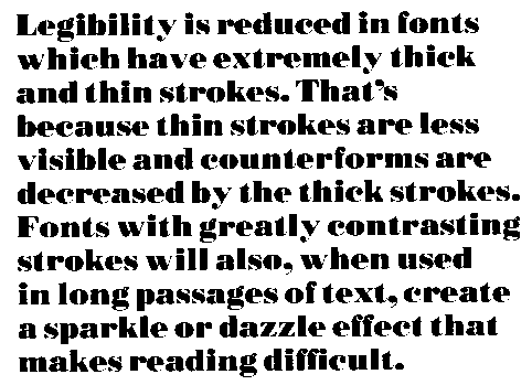
- word contour/stroke contrast: Again, the varying word contours from using lower case tends to be more readable than ALL CAPS DUE TO IT'S RELATIVE LACK OF CONTOUR. The greater the stroke contrast, the harder it becomes to read the font, especially over long periods of time, due to the limited visibility of the thinner strokes trying to compete with the power and form of the thicker strokes
- font height: Certain type faces are meant for larger display, and some are more suited for smaller applications. In general, no smaller than 8pt is a good rule of thumb. Even then, something around 14pt is better due to the number of visually impaired out there.
- font weight: The bolder and thicker the font, the harder it is to read for extended periods of time, due to the solidarity of the forms all becoming a big black mass. In addition, condensed fonts can be hard to read, especially in small sizes and tend to appear very light.
Overall, though, each typeface is different, and the adjustments you make to create greater legibility or readability fall back on the design of the font itself (wide, condensed, large x-height, etc), as well as the environment where it will be used (online, on a billboard, on a business card, etc). The key is finding balance.
Thoughtful quiz question:
Does a font have to be legible in order for it to be readable?
Sources:
Ambrose, Gavin and Harris, Paul. Fundamentals of Typography. 2006
http://archive.cabinetoffice.gov.uk/servicefirst/2001/joinedup/accessible/typeface.htm
http://www.daube.ch/docu/glossary/readability.html
http://en.wikipedia.org/wiki/River_(typography)
http://desktoppub.about.com/cs/finetypography/ht/line_length.htm
http://www.daube.ch/docu/glossary/legibility.html
http://www.problogdesign.com/blog-usability/30-ways-to-improve-readability/
http://www.connorwilson.com/2007/03/12/considering_readability_when_designing/
Readability is affected by a variety of factors:
- Color: The easiest colors to read are those set in good contrast, hence why the traditional method is black text on white background. When using colors, avoid colors that are close to each other on the color wheel. In addition, consider the fact that some people are colorblind when choosing colors
- Word Spacing and Leading: Consistent words spacing and leading is important for readability. Too much word spacing creates gaps between words and can sometimes lead to rivers (spaces between words becoming a form themselves) breaking the flow of reading.
In addition, when word spacing exceeds leading, the eye tends to be drawn down the page, rather than across.
When considering leading, the application is important (long reading should have larger leading, short bits of reading [like when looking something up in a dictionary] can have smaller leading). Too little leading give the text block a darker color and can make it hard to distinguish where to go when moving from one line to the next. Too much leading and the eye can jump around. In addition, certain characteristics of fonts themselves require more leading, such as larger x-heights, strong stroke contrast, or bold time.
- Typeface: Many factors of type can alter it's readability. Generally larger x-heights make reading easier. Fonts with an easily distinguishable upper and lower case also help, as it gives variation to the look of the font on the line and prevents it from looking to static or becoming one big line. In addition, the factors of type that make it legible also make it readable.
- Line Length: When line length is too long or short it slows down reading. Line length definitely depends on typeface but in general, it can be around 39 characters long ('alphabet and a half rule'). Other techniques include the 'points times two' rule where you take the point size, double it, and use that size in picas for your line length. Using both is a great way to get a range for experimenting with which looks best, and then adjusting columns, margins, fonts, etc. accordingly.
- Justification: Generally, a flush left, right rag is the easiest to read (as long as the rag on the right is kept in check). FRLF tends to be harder to read due to the inconsistent line starting points. In addition, Justification, when used incorrectly (with too many hyphenations, widows, orphens, and awkward gaps in spacing) can also impede reading
- Paragraph density: See word spacing and leading
- Grammar used: no matter how nicely something is designed, if it has bad grammar, it still won't be as readable as a well written piece.
Legibility is affected mainly by the typeface design itself, including:
- letterspacing: letterspacing that is too close makes it hard to distinguish one letter from another, yet too much makes it hard to associate the letters as words. In addition, certain letters consecutively need to be kerned closer together. Letterspacing should create a flow and harmony throughout the page
- x-height: larger x-heights tend to give more legibility, even when the type is shrunken down to smaller sizes. However, in excess, readibility is lowered due to the similarities of certain leters, such as h and n
- serif vs. sans serif- A broad generalization is that serif fonts apply well to printed materials and sans serif fonts apply well online. however, the right font merely depends on the situation.
- word contour/stroke contrast: Again, the varying word contours from using lower case tends to be more readable than ALL CAPS DUE TO IT'S RELATIVE LACK OF CONTOUR. The greater the stroke contrast, the harder it becomes to read the font, especially over long periods of time, due to the limited visibility of the thinner strokes trying to compete with the power and form of the thicker strokes
- font height: Certain type faces are meant for larger display, and some are more suited for smaller applications. In general, no smaller than 8pt is a good rule of thumb. Even then, something around 14pt is better due to the number of visually impaired out there.
- font weight: The bolder and thicker the font, the harder it is to read for extended periods of time, due to the solidarity of the forms all becoming a big black mass. In addition, condensed fonts can be hard to read, especially in small sizes and tend to appear very light.
Overall, though, each typeface is different, and the adjustments you make to create greater legibility or readability fall back on the design of the font itself (wide, condensed, large x-height, etc), as well as the environment where it will be used (online, on a billboard, on a business card, etc). The key is finding balance.
Thoughtful quiz question:
Does a font have to be legible in order for it to be readable?
Sources:
Ambrose, Gavin and Harris, Paul. Fundamentals of Typography. 2006
http://archive.cabinetoffice.gov.uk/servicefirst/2001/joinedup/accessible/typeface.htm
http://www.daube.ch/docu/glossary/readability.html
http://en.wikipedia.org/wiki/River_(typography)
http://desktoppub.about.com/cs/finetypography/ht/line_length.htm
http://www.daube.ch/docu/glossary/legibility.html
http://www.problogdesign.com/blog-usability/30-ways-to-improve-readability/
http://www.connorwilson.com/2007/03/12/considering_readability_when_designing/
Friday, September 19, 2008
Thoughts on Design
Ever since Design II, I've started to think about design itself a LOT more. Now, in a semester with 3 design classes, it's pretty hard for me not to notice and questions things around campus, especially posters. It used to be that I'd just walk around and notice if words were spelled wrong on posters....now, I question the design itself: 'well that looks cool, but is it necessary?' 'why did they choose this picture or this font?' 'does the color relate?' etc...In addition, thanks to all of the work we've done in Typography, I ask myself questions like 'what do I read first?' 'what stands out on the page, and is it the main subject?' 'why did they use so many fonts?' 'does it need color?' 'does this create a coding?' etc. Thanks for VisCon, I see birds everywhere, and I consider things like simplicity of the symbols on restrooms, bus stop signs, traffic signs, car insignias....I can really admire symbols and corporate logos now after working on VisCon's second project. 'Clear, Memorable, Innovate' has become my mantra lately, and I'll question symbols I walk by and see if they apply.
Design classes really make you notice how many things you take for granted, and how big and designed our world really is. It's kind of mind blowing.
Design classes really make you notice how many things you take for granted, and how big and designed our world really is. It's kind of mind blowing.
Time Warner
Today, I went to the Art and Architecture library to get books on symbols and logos (to help with my VisCon project).
One of the books had corporate logos and the processes, ideas, etc, that the designers went through to create the symbol. Flipping through this book I came across the page for Time Warner. Time Warner was actually two companies that merged: Time Inc., a publication company, and Warner Communications, an entertainment company. The designer decided to create logo that would encompass the ideas of both journalism and entertainment: looking and listening, reading and hearing, sending and recieing, etc....An eye and an ear were chosen to be used as symbols to represent both aspects, and in the final logo, they are combined to become the logo we know today:
.
I just thought this was a very interesting revelation, because I had never really given too much thought to the logo before. Now I can see the ear and the eye and the logo becomes more powerful that way (kind of like with the arrow in Fed Ex)
Source:
Thomas, Gregory. How to design Logos, Symbols and Icons. 2000
One of the books had corporate logos and the processes, ideas, etc, that the designers went through to create the symbol. Flipping through this book I came across the page for Time Warner. Time Warner was actually two companies that merged: Time Inc., a publication company, and Warner Communications, an entertainment company. The designer decided to create logo that would encompass the ideas of both journalism and entertainment: looking and listening, reading and hearing, sending and recieing, etc....An eye and an ear were chosen to be used as symbols to represent both aspects, and in the final logo, they are combined to become the logo we know today:
.
I just thought this was a very interesting revelation, because I had never really given too much thought to the logo before. Now I can see the ear and the eye and the logo becomes more powerful that way (kind of like with the arrow in Fed Ex)
Source:
Thomas, Gregory. How to design Logos, Symbols and Icons. 2000
Wednesday, September 17, 2008
Videogames and design
One of my hobbies (when I'm not busy with homework...) is playing videogames. As such, I also like to keep up with videogame news through joystiq.com.
Below, I've posted some links from there that relate videogames and art:
http://www.joystiq.com/2008/09/17/agdc-reset-play-more-gaming-inspired-artwork/
^ The Reset/Play exhibit in the Arthouse in Texas
http://www.joystiq.com/2008/09/16/travelling-without-moving-wants-your-videogame-photos/
^An interesting idea for for more meaningful uses of screenshots
In addition, the trailer for the game Mercenaries 2 has not only a catchy song, but also a 'making of' video that shows the steps the company had to take to make the trailer. I didn't really think about it too much, but trailers themselves have to be designed pretty deeply too...it's not just splicing together a bunch of game footage:
Mercenaries 2 Trailer
Making of Mercenaries 2 Trailer
When you think about it, videogames have to be HIGHLY designed. The player must know where to go, what to do, and how to do it, most of the time without being explicitly told 'do this' or 'go here first.' It's something that should come naturally, and most unsuccessful games come from the player having to 'fight' the game, thanks to unclear graphics, confusing level design, glitches, bad button mechanics, or puzzle designs that are too hard to figure out or too hard to accomplish.
And finally:
Here's a small interesting website design...the company logo is also quite intricate, but fits nicely with the company name: Armature
"Why the name, Armature?
It really defines how we work as a company. It's defined as "a skeletal framework built as a support on which a clay, wax, or plaster figure is constructed" and we want to structure our development that way. The first stage of the development is the substructure, and then we direct a larger team of people to help us in filling out the full game."
~Interview with Armature by Joystiq
Below, I've posted some links from there that relate videogames and art:
http://www.joystiq.com/2008/09/17/agdc-reset-play-more-gaming-inspired-artwork/
^ The Reset/Play exhibit in the Arthouse in Texas
http://www.joystiq.com/2008/09/16/travelling-without-moving-wants-your-videogame-photos/
^An interesting idea for for more meaningful uses of screenshots
In addition, the trailer for the game Mercenaries 2 has not only a catchy song, but also a 'making of' video that shows the steps the company had to take to make the trailer. I didn't really think about it too much, but trailers themselves have to be designed pretty deeply too...it's not just splicing together a bunch of game footage:
Mercenaries 2 Trailer
Making of Mercenaries 2 Trailer
When you think about it, videogames have to be HIGHLY designed. The player must know where to go, what to do, and how to do it, most of the time without being explicitly told 'do this' or 'go here first.' It's something that should come naturally, and most unsuccessful games come from the player having to 'fight' the game, thanks to unclear graphics, confusing level design, glitches, bad button mechanics, or puzzle designs that are too hard to figure out or too hard to accomplish.
And finally:
Here's a small interesting website design...the company logo is also quite intricate, but fits nicely with the company name: Armature
"Why the name, Armature?
It really defines how we work as a company. It's defined as "a skeletal framework built as a support on which a clay, wax, or plaster figure is constructed" and we want to structure our development that way. The first stage of the development is the substructure, and then we direct a larger team of people to help us in filling out the full game."
~Interview with Armature by Joystiq
Subscribe to:
Posts (Atom)
