Friday, September 12, 2008

Frutiger and Univers...who needs the e anyway


Adrian Frutiger is (arguably) one of the most influential typographers of the 20th century. Born on May 24 1928, the life and work of this Swiss graphic designer has spanned the ages of drastically different type processes: hotmetal, phototypesetting, and digital typesetting. He has written many books, won numerous awards, taught in Paris, and a few of his fonts have become famous and are used world wide. In addition to being a typographer, he is also a painter, sculptor, symbolist and mathematician.

Frutiger grew up in Unterseen, near Interlaken, Switzerland. As a boy, he rebelled against the strict handwriting system taught at his school and instead experimented, at one point cutting the pen down to a broad nib to imitate the handwriting of one of his idols.

At the age of 16, he was apprenticed as a compositor (typesetter) at a printing studio for four years, and then attended the Zurich School of Arts and Crafts (Kunstgewerbeschule), focusing on calligraphy.

After his schooling, he went to Paris to work for Deberny & Peignot, revamping old types to work on newer machines. In addition, he worked on new fonts, such as "Président", "Phoebus", and "Ondine". It was in 1957, however, that he gained international recognition with the creation of his font Univers.

From then on, Frutiger has opened his own studio, taught at two French schools, worked for IBM as a consultant, created the typeface for the Charles de Gaulle airport, and created over 30 fonts.

Frutiger is still alive today and lives near Bern, Switzerland

Sources:
http://www.linotype.com/793-12658/handwriting.html
http://en.wikipedia.org/wiki/Typesetting
http://en.wikipedia.org/wiki/Adrian_Frutiger#cite_note-1
http://www.typophile.com/node/12118
http://www.identifont.com/show?110
http://www.monotypeimaging.com/ProductsServices/TypeDesignerShowcase/AdrianFrutiger/
http://artfilm.ch/adrianfrutiger.php?lang=e&id=adrianfrutiger&suche=dvds


UNIVERS

Univers is a sans serif font created by Mr. Frutiger released in 1957 containing 44 different styles. It was the first font to use his special numbered classification for the different styles of the font face. Univers was also unique in that the entire family of font styles was all created at once as a complete unit, rather than later being expanded upon.

In this univers grid, even numbers are italic (or oblique) ad odd numbers are roman. The first number stands for the stoke weight, with 1 being lightest and 9 being heaviest. The second number represents the position and width. with 1 being the most extended to 9 being the most condensed. By this system, 55 is the the original, roman style of the typeface.

Sources:
http://en.wikipedia.org/wiki/Univers

Thursday, September 11, 2008

The status is NOT quo

Dr. Horrible's Sing-Along Blog is a 40ish minute online 3 part video made by none other than Joss Wheedon (Buffy), and staring Felicia Day, Neil Patrick Harris (aka Doogie Houser), and Nathan Fillion. It's become somewhat of a cult classic, and includes quite a few funny and quoeable lines.

Ever since Design II, I've always been amazed by how movies work. The camera angles, the transitions between shots, it's all delicately planned so that it's not choppy. I mean, even just switching between faces when two people are talking to each other: how do we as a viewer understand this as a conversation, seeing only one person in the frame at a time, one talking facing one direction, and one the other. How should the camera follow a person? All of this is especially interesting to me because it applies to comics as well. Without showing the entire scene in every frame, you have to give the reader a sense of what is going on, as well as the environment itself.

In musicals like this, it's especially interesting to me to see how they transition into songs so that everything still all flows together.

Wednesday, September 10, 2008

Baskerville: the man, the font, and no, not the hound...


THE MAN

John Baskerville, born in 1706, was an English printer known today for his creation of the font that shares his name. Before working as a printer and typographer, his jobs ranged from tombstone engraver to the business of japanning (a lacquering process to make European imitations of Asian lacquer works)
John made many improvements to the printing world in addition to his creation of Baskerville. After starting up his own printing company, he improved existing types and printers, and even created new inks and better paper. Because of his hard work improving all parts of the printing process, Baskerville’s printings were usually clearer and blacker than the competition, which worked out well since his font had some pretty narrow strokes. In fact, most people at the time criticized the font for its thinness, and Baskerville didn’t gain attention or proper use until as late as the 1920s!
Among Baskerville’s printed works, his most notable piece is his Bible in 1763. Considered by some to be the ‘finest printed work in England,’ the Bible also stands out because Baskerville was an atheist. In addition, Baskerville also printed Milton’s Paradise Lost and Paradise regained, and even printed for Cambridge university.
Upon his death in 1775, he was buried in the non-consecrated ground of his own house, later being moved to a couple of different locations after the house was demolished to build a canal.

THE FONT


Baskerville is a transitional font, providing a segue between the traditional Caslon font and newer fonts. Baskerville is characterized by its thin lines, and was in fact criticized for being too thin. Overall though, it was based on the Caslon font, designed to be an improvement: straighter letters, a straighter serif, and the higher contrast between thick and thin lines. During John Baskerville's lifetime, the font was not very popular, however, it's poplarity grew over time: starting with Ben Franklin bringing it to America (used in governement documents) and later to it's rise in popularity in the 1920s.


http://www.linotype.com/702/johnbaskerville.html

http://en.wikipedia.org/wiki/John_Baskerville

http://en.wikipedia.org/wiki/Baskerville

http://www.uh.edu/engines/epi1761.htm

http://ilovetypography.com/2007/09/23/baskerville-john/

http://www.identifont.com/show?22P

http://en.wikipedia.org/wiki/Japanning

Monday, September 8, 2008

Switzerland

I saw this in a book about Switzerland that I was using in my Visual Concepts class. I thought that it was interesting, not only because my classes are crossing over, but also because it uses different sizes and directions of type to give movement and value to the piece.

Friday, September 5, 2008

Speaking of logos...

An article on Joystiq.com (an online source for videogame news) mentioned the similarity between a newly designed post office logo and two other well known (relatively speaking) video game logos:


It really made me realize the power of well designed symbols/logos.

That and the fact that a combination of Marathon (first person shooter designed by Bungie, now well known as the creators of the Halo series) and Pokemon (technically a turned based rpg, well known for it's use of more than 400+ different creatures to catch and train), would be hilarious and/or awesome.

Wednesday, September 3, 2008

Layout change

Changed the layout to one of the default templates.

I figured I'll just make my own layout when I get enough time

and to make this post more design related,

M.C. Escher is one of my favorite artists, not only because of his use of optical illustions but also because his art has mathematical influences (for example, all of his tessellations). Most people are familiar with at least one or two of his works, but he has quite an extensive portfolio. Check out the picture gallery on the site if you're interested.

Sunday, August 31, 2008

the GRID

Blog:
-- why do we (designers) use a grid? what are the benefits or functions?
-- include any online links, research, thoughts, examples...

Designers use a grid to help them arrange visual elements. The grid gives control and organization to a piece, allowing a designer to repeat elements of the grid throughout a work, adding consistency while avoiding monotony. Grids are especially helpful for aligning objects vertically or horizontally on the page, especially in a modular grid. Grids help to create movement, to lead the viewer's eye around the page, and to arrange the use of space.

Grids can range from simple to complex, depending on the function and content of the grid. For example, text on a page of a novel is usually arranged in one large single column grid. Margins around the edges allow for information like page number and chapter title, as well as buffer space to keep the text from running into the spine of the book (where it would be hard to read), or from pushing it too close to the edge of the page (where there would be no space to hold the page). The grid for a magazine, however, would become more complex, leaving room for numerous pictures, captions, larger article titles, etc., while also conforming to an overall consistent grid for the whole magazine itself. The main thing to remember about grids is that they can (and should be) tailored to the situation.

The grid is used as a foundation, something that helps gives the designer control the arrangement on the page, while also being flexible enough to allow designer to work in a dynamic fashion. It should not be viewed as a restriction; rather it is a tool for the designer, highly adaptable for many situations. Not all grids have to be straight vertical and horizontal lines. However, when using different grids, or eschewing grids altogether, the designer must be especially careful when creating the layout. The layout still needs the control, order, hierarchy, etc., because the viewer doesn't not even have any sort of linear grid pattern to fall back on.

In our day and age, grids exist not only in print form, but also in the virtual real of internet. I was surprised when I searched 'grid design' in Google, and I returned a bunch of URLs for CSS website grids. I didn't even think about how websites are made out of grids, even though just looking at them, it all makes sense.

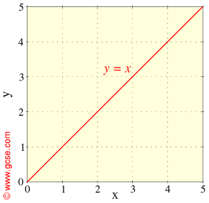
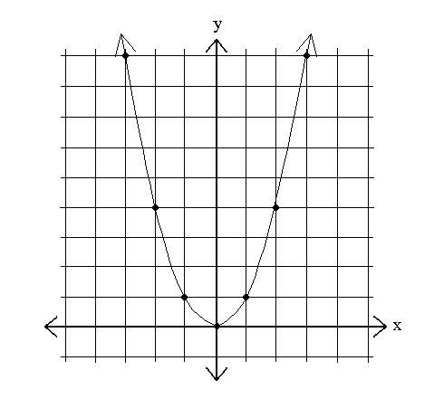
In all honesty, my very first association with the word 'grid' is the Cartesian coordinate system (I am a math minor). If you think about it, graphing and graph paper illustrates the main use of a grid: a visible illustration of abstract ideas. Without the graphical foundation, it's hard to understand equations like y=x or y=x^2, and harder still to explain it to others. In the same way, putting your ideas on paper for design on paper helps you to see what it would look like, because if I've learned anything from Design II, ideas in your head sometimes just don't transfer to paper the same. Consider also the flexibility of graphs: you can change the scale (0 to 10? 0 to .001? 0 to 10^30?), you can change the values (x=time, x=distance, x= number of waffles, etc), and you can even change the way you use the graph (ex. using polar coordinates). In the same way, grids in design are immensely flexible and are there to work FOR you, not AGAINST you.


from left to right:

y=x

x=x^2

polar coordinate graphing


Grids are present in more places and in more ways that I ever even thought about. Just looking around my dorm room, I can look at different items and see the grids underlying them. Recognizable enough to direct my eye [Sketch...Strathmore...A lightweight sketch paper suited...], but subtle enough that the grid doesn't jump off the page. I feel like now that I've started noticing grids, I'll never stop noticing them. It's like my eye's are slowly being opened to this secret world that's hidden in plain sight. Grids can be quite powerful tools, and I hope that all this research helps me with my homework!

[As a side note, I love relating math and art...I think that a lot of people view them as two totally removed and separate fields, when really there are a lot of parallels and interesting connections...some that people use and don't even realize it (golden ration, proportions/scale, to name a few)]


Sources:
- Sketchpad pic
- Polar graph pic
- y=x^2 pic
- y=x pic
- Mark Boulton
- Grid -Wikipedia
- Six Creative Column Techniques
- Design by Grid
- Article about CSS layouts