- Measurements with fixed values. They are expressed in finite terms and can't be altered. Points and picas are absolute measurements


Points/Picas
-The basic measurements of type. Points are used to measure font size. Originially, a font's size was determined by the height of its type block (back in the movable type days). Now, it's the measurement of its height from the highest ascender to the lowest descender. 1point (pt) = .35mm or 1/72in. 12pt = 1 pica. Pica is commonly used for measuring lines of type.
Relative Measurement
- Measurements that depend on other variables and thus have no fixed value. Measurements such as leading, character spacing, ems and ens are all relative measurements
 x-height
- the height of the lowercase letters of a font, minus any ascenders or descenders (measured as the length from the baseline to the top of a lowercase x) . The larger the x-height, the larger a font appears to be. in addition, characters with rounded tops (ex. b, d, o, etc) actually extend a little bit over the x-height in order to perceptually seem the same size.
The em. The en
- The em is used to define basic spacing functions. It's equal to the size of the type, so if the type is 36pt, then the em is 36pt. Even though it sounds like it should be realated to the letter m, it the m will rarely be as wide as the em.
- The en is half of the em. So if the type is 36pt, then the en is 18 pt. The en rule is used for nested clauses as well as 'to' phrases, such as in 10 to 11 or 1999 to 2000.

Dashes
- Ems and ens are used in punctuation to dente dash length, and each has a specific function.
- The em is the size of the font itself and is used to separate out parenthetical thoughts as well as to show when there is an interuption
- An en, as stated earlier is 1/2 of an em and is used for nested clauses, as well as the 'to' phrases. In addition, it can be used like the em dash to separate out paranthetical thoughts when an em dash would be at the end of a line or would look odd. The en is also used to combine two hyphenated terms, and also to combine two terms that don't modify each other (for example, with names as is common in science: Boss--Einstein Condensate
- A hyphen is 1/3 of an em, and is used to join words and separate syllables.
- As a note, the bullets I am using in this blog entry are hyphens; in addition, em and en dashes are not part of a standard keyboard and instead fall under special characters.
Alignments: Justification, Flush Left, Flush Right
- Alignment is the relationship of text to the ends of a column
- Justification has even edges and makes a nice shape on the page. It's the most efficient use of space, however, it can lead to awkward gaps when line length is too short when compared to type size. Hyphenation is often used to help make it look more even.

- Flush Left makes the left edge hard, but the right edge soft. Although pretty much the norm today it was rarely used until the 20th century. It follows the flow of language, rather than the idea of a fixed shape. However, one must be careful to make sure the right edge doesn't look too ragged/uneven, nor that it looks too even (thereby looking just like justified alignment). Also, hyphenation should be kept to an absolute minimum.

-Flush Right is the opposite of Flush Left, making the left edge hard and the right edge soft. It is harder to read due to the different starting points of each line, and so should not be used for large bodies of text. However, in smaller blocks is makes effective marginal notes, sidebars, pull quotes or other passages that comment on a main body or image. In addition, a flush or ragged edge can suggest attraction or repulsion between chunks of information.

Letterspacing
- Adusting the space between letters. Generally, however, letterspacing refers to adding spacing and is associated with tracking.


Kerning
-Adjusting the space between letters. Kerning give the letters a more cohesive feel, rather than having a fixed amount of space around each letter. Generally, this is done automatically on the computer, using special kerning tables based on letter pairs. However, when type is changed dramatically, sometimes manual kerning must occur to keep letters from looking awkwardly spaced. Generally, kerning refers to reducing space between type
Tracking
- Adjusting the amount of spacing between characters. Too much positive or negative tracking, however, can make make words hard to read either by making the letter too spaced or our too close together. Negative tracking is rarely desireable. Positive tracking is used most often with capitals and small capitals to give a more regal feel. Generally, tracking refers to increasing the space between type.
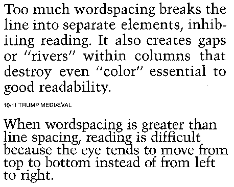 Word Spacing
-A relative measurement used to define the spaces between words. It is a percentage value of an em, so it depends on the size of the type. This percentage varies between different typefaces.

 Widow
- A lone word at the end of a paragraph. This is NOT desireable and the type should be somehow adjusted to avoid this
 Orphan
- The final one or two lines of a paragraph separated from the main paragraph to form a new column and should be avoided at all costs
 Leading
- The space between lines of text in a text block. It derives it's name from the strips of lead that were inserted between text measures in order to space them accurately. Leading usually has a larger point size than the text to make the text blook more balanced and well spaced. Since letters in different font faces occupy different amounts of the em square, the same amount of leading and same size can give quite a different effect.
Indent, First Line Indent, Hanging Indent
- Indent is moving some or all of the text lines in from the margins by a specified amount. It gives an easy entry point into a paragraphy, and it related to the size of the type. Additionally it can be determined by the grid.
- First Line Indent is where the text is indeted from the left margin in the first line of the second and subsequent paragraphs. Generally, the first paragraph following a heading, subhead, or crosshead isn't indented because it introduces an awkward space, although it can be done
- Hanging indent is an indention from a left or right margin which affects several textlines (like a running indent), however the first line is not indented.


